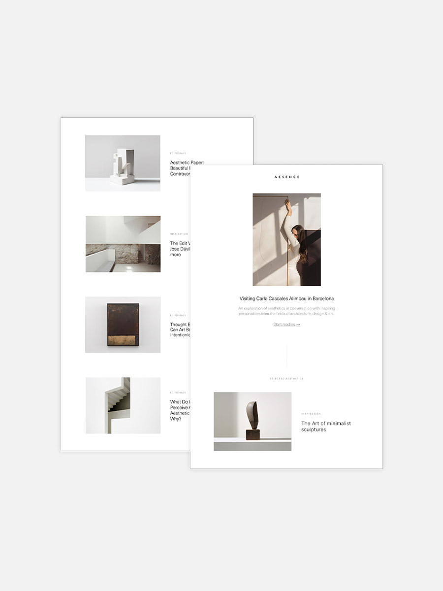
The internet is full of inspiration. Every day I discover beautiful art, design, and architecture – but often these little treasures get lost in the digital clutter. With ‘The Edit’ I want to share a carefully curated selection of outstanding artworks, stunning architecture, and inspiring designs that catch my eye in my daily research.
This issue is all about shapes and forms. Shapes play a central role in art and design, as they are the fundamental elements from which visual compositions are created. In art, shapes create a connection between the artist and the viewer. They can be abstract, organic or geometric and convey different moods and meanings.
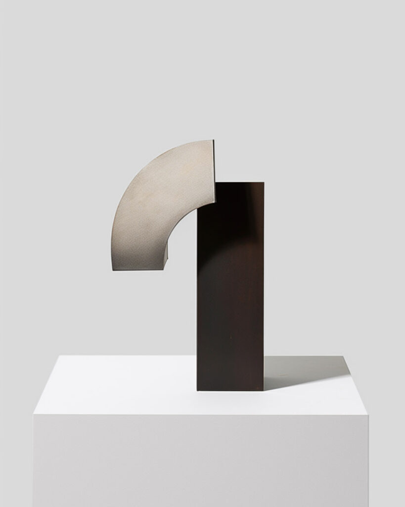
Image no. 1 shows an abstract sculpture, which combines various geometric shapes and materials. It combines two geometric shapes, resulting in a harmonious interplay of structure and space. The combination of the clean, rectangular base and the curved, semicircular upper half gives the sculpture an aesthetic balance.
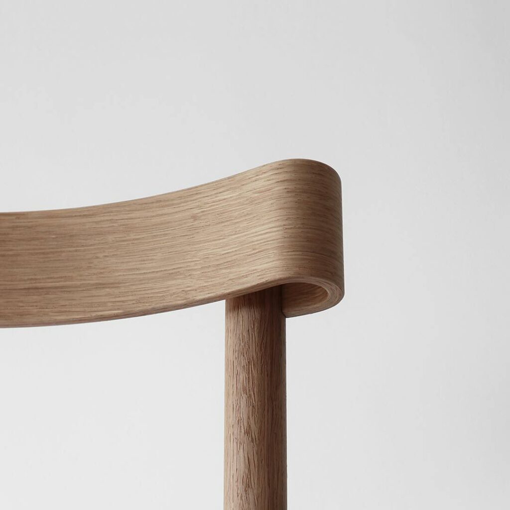
In design, shapes are just as essential – here they influence not only aesthetics but also functionality. But how a design is captured photographically also plays a decisive role. In picture no. 2 we see the Still Life Chair by Marcel Sigel. A special detail here is how the backrest curves around the chair.
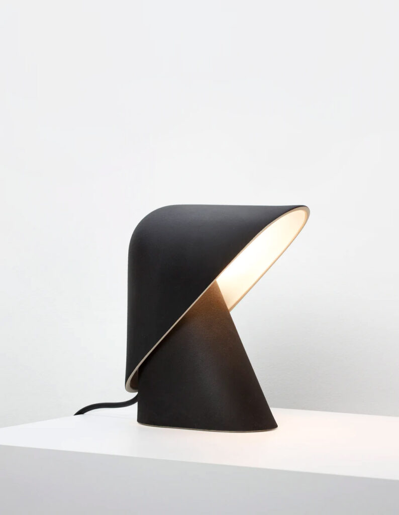
Image No. 3 also shows very nicely how function and aesthetics can merge with the help of well-chosen forms. The K Lamp is a minimalist lamp designed by the British brand Vitamin. It consists of two parts – a shade that acts as a diffuser and a base that houses the lamp.
Contrasts as visual harmony
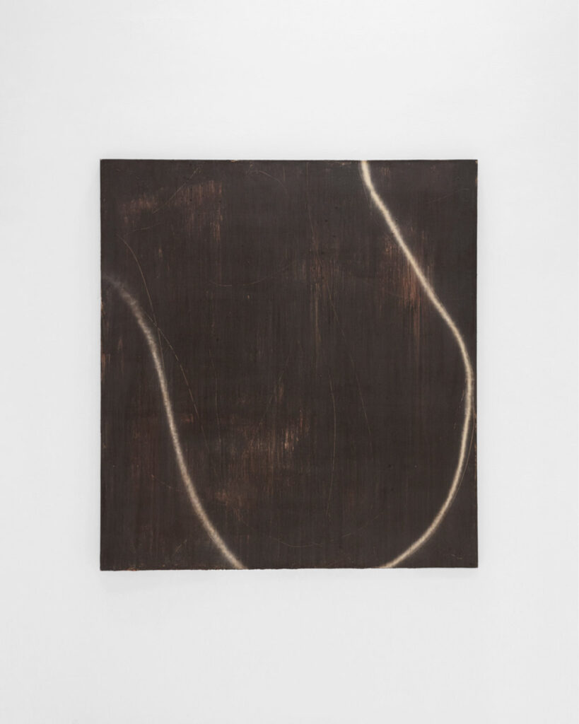
Contrasts in shapes are central elements that create dynamic tension in both art and design. The two artworks below illustrate this in a fascinating way. In the left-hand work by Spanish painter Enrich R., the minimalist composition is dominated by a softly curved, organic line that runs gently across the dark background of the canvas.
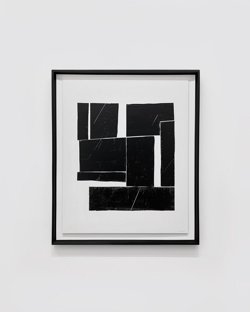
In contrast, the work on the right (image 5) shows a combination of strict geometric shapes with clear lines and hard edges. These forms are much more structured and convey a sense of order and rationality. The contrast between the gentle, soft line in Enrich R.’s work and the strict geometry of the work on the right illustrates how different forms can evoke different emotional responses.
