The internet is full of inspiration. Every day I discover beautiful designs and inspiring interiors – “The Edit” is home to a wide variety of projects, from architecture to photography to graphic design.
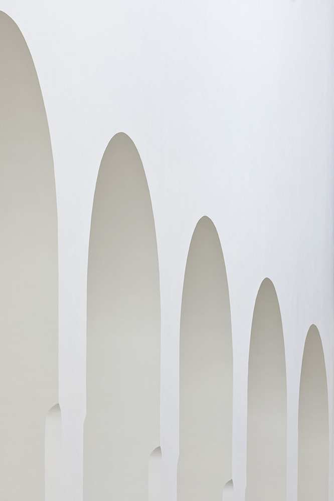
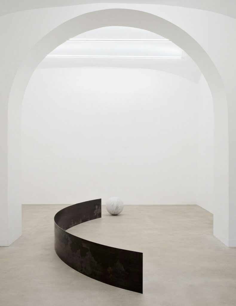
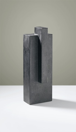
Let’s start with some random inspiration. On Instagram, I found a beautiful photograph by Roberto Apa from the Exhibition view of Giulia Marchi at the Matèria Gallery in Rome from February 2022. It is her second solo show of her at the gallery (left photo). On Artnet, I found a beautiful minimalist sculpture by Swedish silversmith Wiwen Nilsson. The sculpture was designed in 1955.
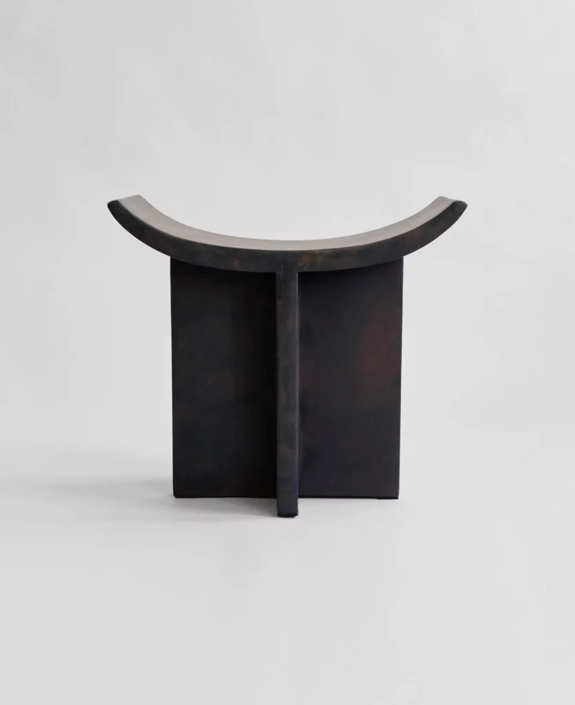
The Brutus collection by 101 Copenhagen is inspired by the Brutalist architecture movement of the mid-20th century. In the lower picture, you can see the Brutus Stool. Drawing on traditional Japanese wooden stools, the curved seat and signature cross legs make for perfect extra seating around the table.
Minimalist Web Design Inspiration
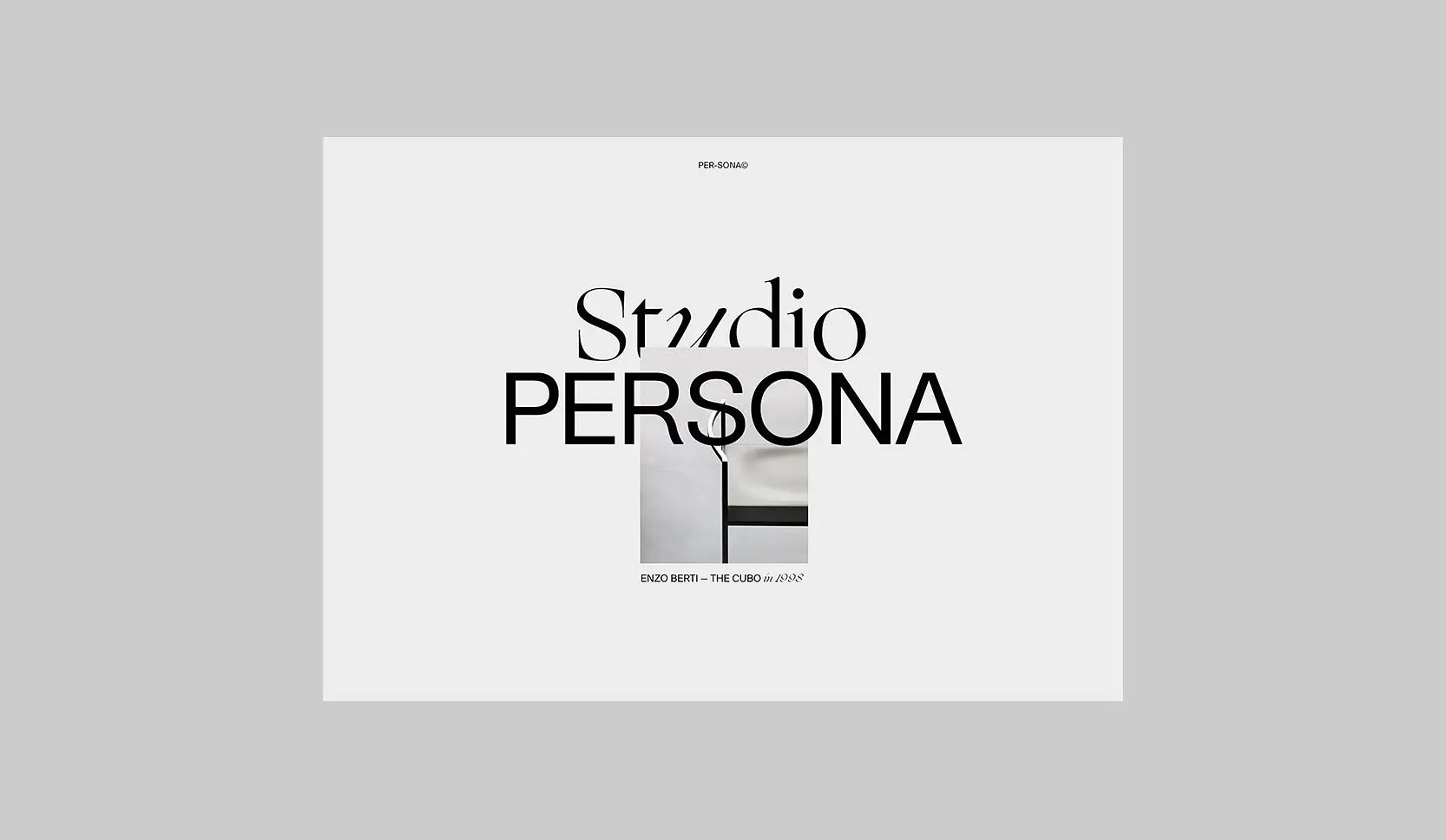
Recently I came across this minimalist web design on Rron Berisha’s Instagram profile. The typography is beautifully highlighted and complements the image, making it stand out amongst other start pages that tend to look the same these days. It’s refreshing to see something special in such a minimalist way.
Icicle Store designed by Bernard Dubois
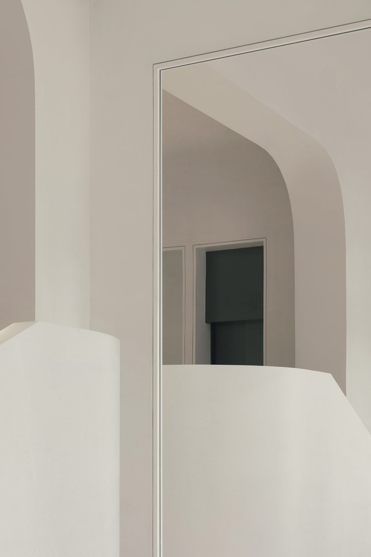
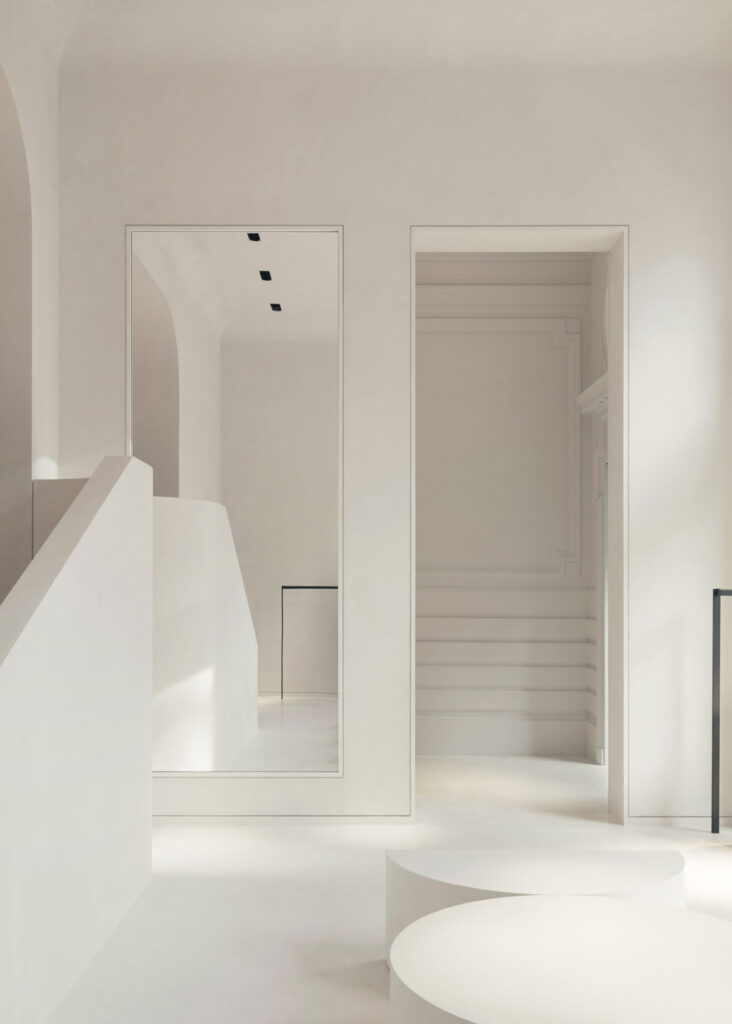
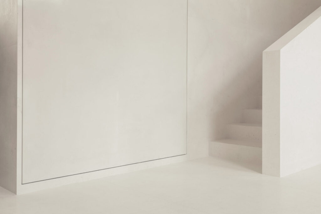
On Pinterest I found this beautiful minimalist interior design by Bernard Dubois. The renowned Belgian architect has designed the second ICICLE store in Paris’ luxurious shopping district, representing the brand’s eco-friendly lifestyle. In keeping with the store’s philosophy, the 226 square-meter contemporary space conveys the message of consuming consciously and better, with noble and natural materials.
At the store’s center lies a monumental staircase that leads to two upper levels. Textures and contrasts are accentuated by touches of brushed bronze and shiny, striated lacquered beige panels that delineate the fitting room area. Romain Laprade‘s beautiful photography perfectly captures the atmosphere and details of the minimalist interior.
Shaped Aesthetics by CARA \ DAVIDE and Cheshire Architects
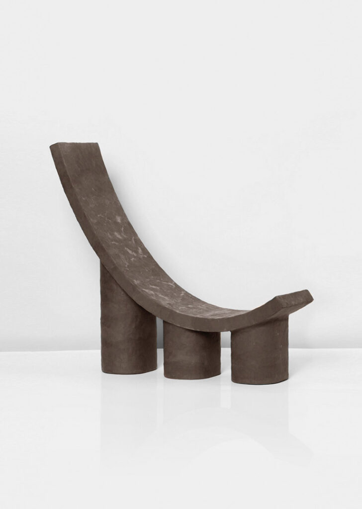
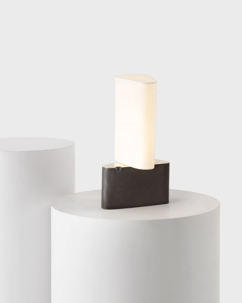
What do these three selected objects have in common? They have made their form an integral part of their aesthetics.
On the left side, we have the Territorio Chief Chair by CARA \ DAVIDE from 2018 where formal elements such as thicknesses, proportions, mass, stature, and synthetic geometries were gathered in the research to create this minimalist chair. The Fulcrum Table Lamp, shown in the image at the bottom, is a modern and minimalist re-imagining of a classic archetype. A unique silhouette and an elegantly pivoting shade allow for versatile expression.
Moritzkirche by John Pawson
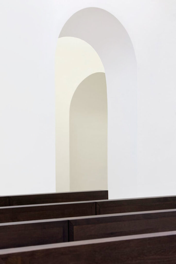
Even though this project is a bit “older”, it still found its place in this issue. The Moritzkirche, a minimalist church conversion in Augsburg designed by John Pawson, is a good example of how minimalist architecture can be used to create a sense of calm and contemplation.
For almost a thousand years, the parish church of St. Moritz has been an integral part of the local community. Through the years, it has endured devastating fires, changing liturgical trends, aesthetic transformations, and wartime bombings, each leaving its own imprint on the building. In 2009, John Pawson was commissioned to help bring this historic building into the modern era, introducing a sense of clarity and light to the sacred space. I love how Hufton+Crow captured the essence of this project.
