For a long time, minimalism in design was considered the epitome of timeless aesthetics, functionality, quality, and good taste. As a result, more and more brands and products began to focus on a more reduced appearance, but at the same time became more and more similar. Therefore, the questions come to my mind: Is minimalist design always synonymous with good design? Is reduction to the essential really the key to good design? Is “less” always “more”?
Minimalist design = Form follows function = Good design?
Minimalist design follows the principles of “form follows function” and “less is more”. Simply put: the design of an object should be derived from its purpose, and everything unnecessary is left out. In this way, it enables a clear message without getting lost in superfluous details.
But just because a design follows its function doesn’t automatically mean it’s “good.” After all, considering only the function would be just as wrong as considering only aesthetics!
So what does it take to call a design “good”? Of course, in addition to basic aesthetic principles, it should also ensure intuitive usability, be sustainable and effective, and at best even arouse emotions. (If you want to dive deeper into this topic, I can recommend the following articles: Should Design Be Subjective Or Objective? and The Debate On Timeless Aesthetics: What Makes Art & Design Last?)
In order for a design to truly be defined as “good,” numerous factors must be considered: How does the design fit into its environment? What impact does it have on its users? What causes it to be used joyfully, often, and for a long time? The answers to these questions should always be taken into consideration during the design process. The key to good design, then, is to understand the user and how certain design elements can be used effectively to achieve the desired result.
Is Minimalist Design a Loss of Identity?
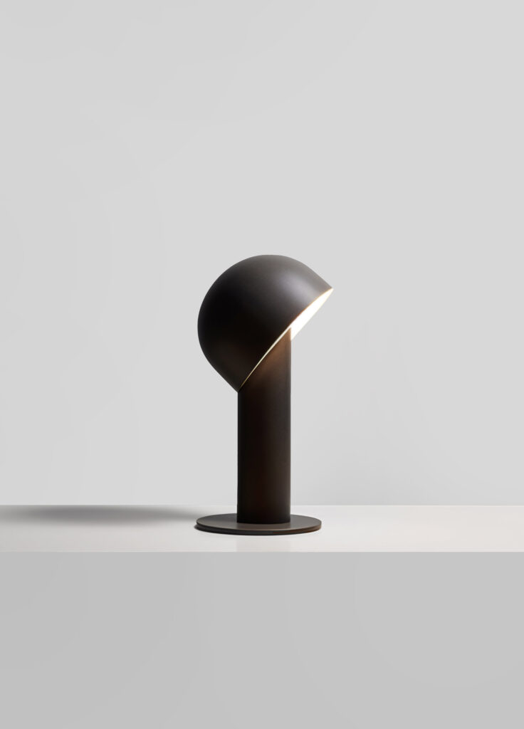
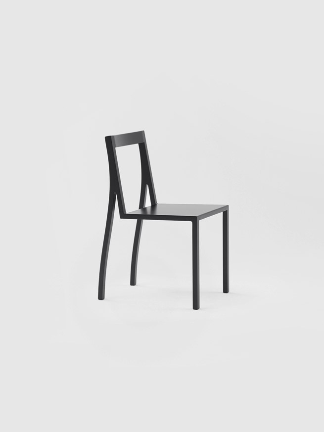
The criticism that minimalist design often appears uniform and monotonous is not unfounded: Many pieces of furniture, buildings, websites, layouts, etc., do indeed look the same. So the biggest difficulty is to create a unique identity.
In this context, the targeted use of details is of particular importance – they make the design distinctive. The absence of details, on the other hand, can also be a deliberately used stylistic element to emphasize the uniqueness of a design. But beware: if composition, color choice, symmetry, and other important design elements do not make the overall design convincing, the absence of details can determine whether the design is good or bad. (Read more about that here: What Makes Minimalist Design? The Big Picture Or The Detail?)
As is often the case, it’s about finding the right balance – details that convey an identity need to be used just as carefully as reducing them to the essentials.
Minimalist Design = Good Design if Details, Identity, Aesthetics & Function are in Balance
Minimalism in design is an effective approach when it comes to developing clear, aesthetic, and functional solutions. So less can actually be more, as long as the design achieves a harmonious balance of aesthetics, function, details, and identity. It’s important to focus on how each aspect of a design contributes to the user experience and how it can be customized to its desired purpose on an individual level.
So yes, minimalist design can lead to good design, but it’s not a guarantee. But it does guarantee a good starting point.
How do you see it? Is minimalist design synonymous with good design? I’m looking forward to your comment!
Further Reading / Interesting additions
https://www.artichoke-ltd.com/journal/the-danger-of-minimalist-design-the-death-of-detail/
https://usabilitygeek.com/less-is-more-importance-minimalist-web-design/
About Exploring Aesthetics:
Sarah loves asking questions and exploring the things she engages with on a daily basis. Exploring aesthetics is her column which discusses art, design, and aesthetics to explore, inspire, and question the status quo.
