The internet is full of inspiration. Every day I discover beautiful art, design, and architecture – but often these little treasures get lost in the digital clutter. With ‘The Edit’ I want to share a carefully curated selection of outstanding artworks, stunning architecture, and inspiring designs that catch my eye in my daily research.
Let’s start this time with a small selection of beautiful minimalist lamps. Lamp design is so much more than just an object that provides light. The following examples show how modern lighting design blurs the boundaries between art and design, creating aesthetically pleasing and useful objects. First, I would like to share the Fungi table lamp by Guilherme Wentz with you (Image 1). Inspired by the world of fungi, the minimalist table lamp is characterized by its reduced formal language. The cylindrical base and the slender lampshade give the lamp an elegant and sculptural appearance.
The Nonus wall light by Brooklyn-based designer Ryan Kahen (Image 2), is an ode to Pluto and an exploration of the unique characteristics of the former ninth planet’s journey around our sun. Based on the gravitational dance between Pluto and its largest moon, Charon, the lamp’s design is characterized by two circular geometries that intersect, creating an asymmetrical balance.
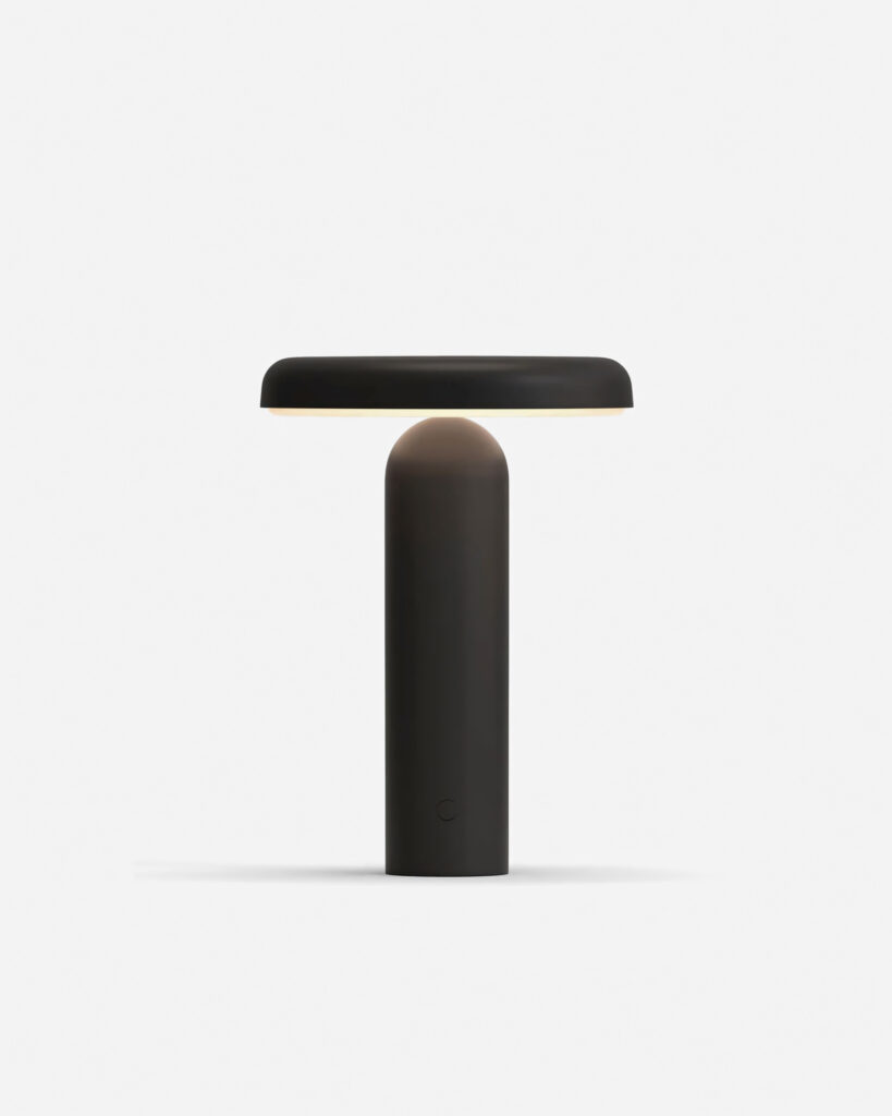
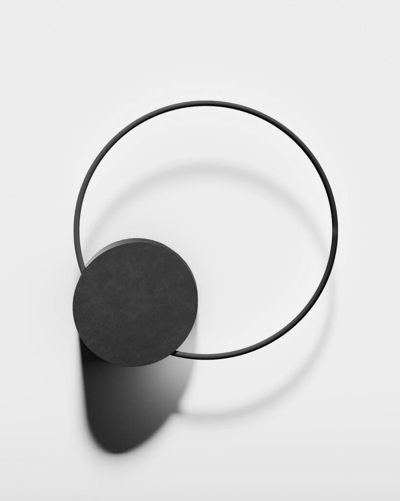
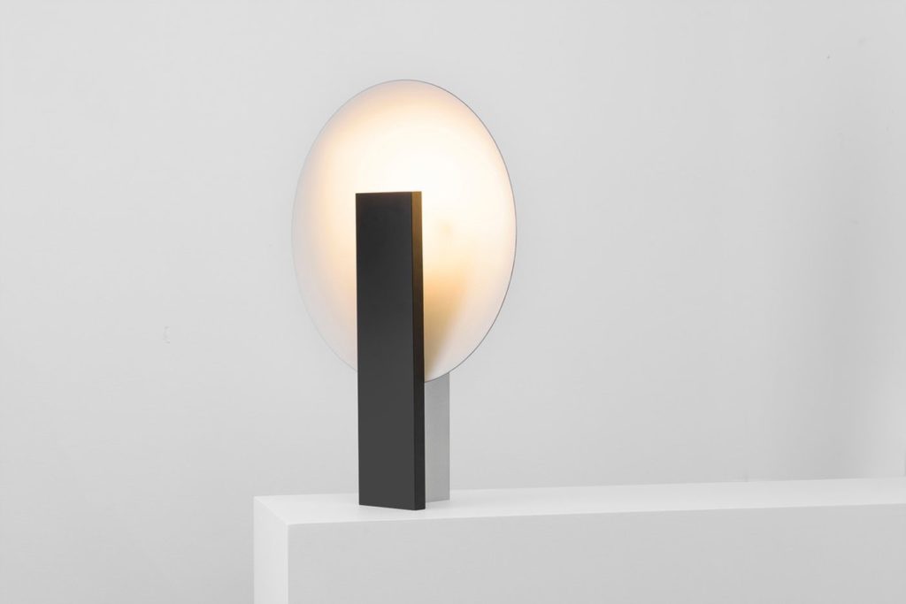
And then I would like to share the ORBE table lamp by Estudio Rain with you (Image 3). The design is characterized by clean lines and a simple but striking shape. The lamp consists of a vertically positioned rectangular base that contains the light source and gives the luminaire the necessary weight. Behind it is a round disk that diffuses the light and creates a soft, even illumination. The design is balanced and harmonious and shows how beautiful lighting design can be.
Moda Three by McKimm Architects
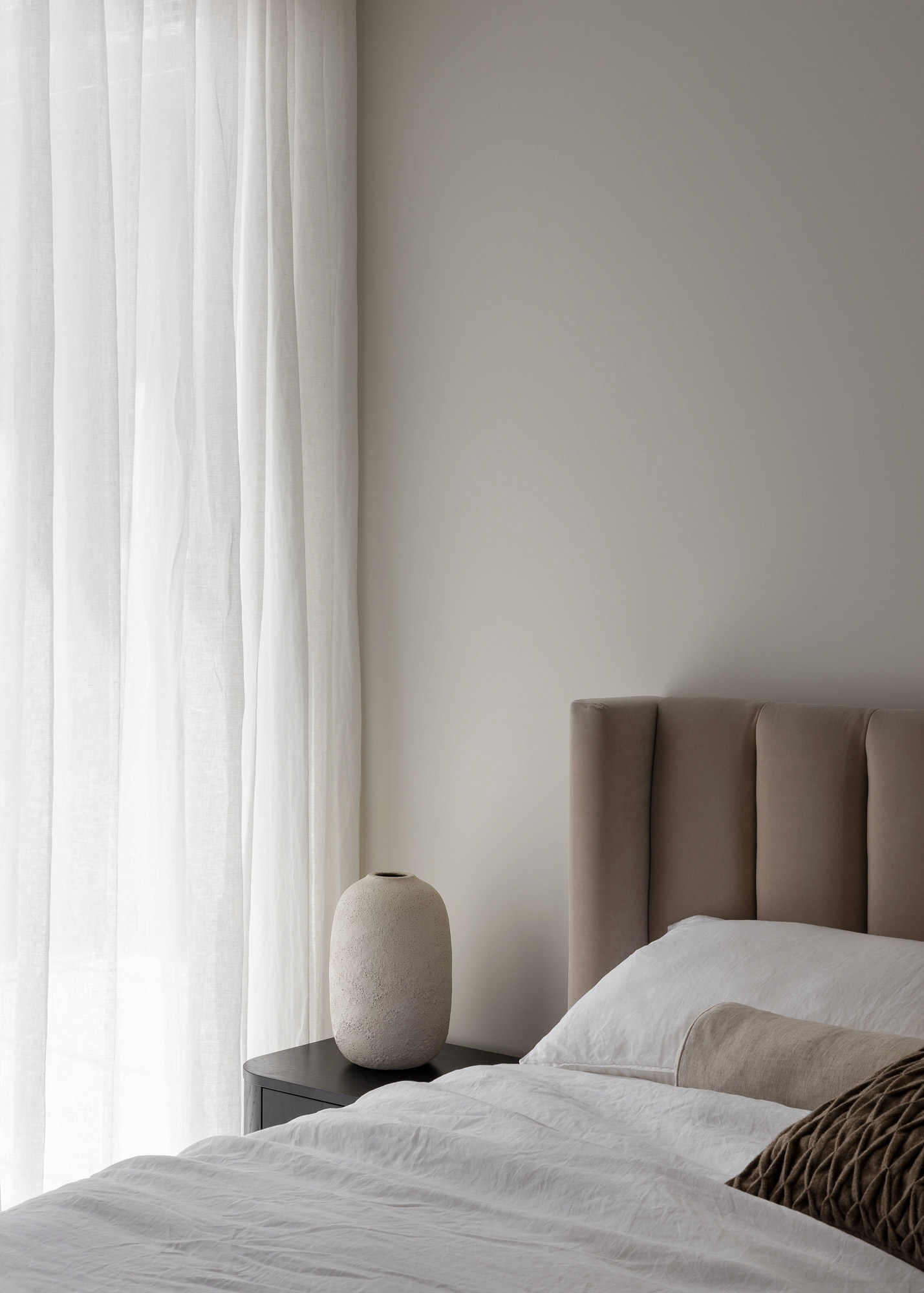
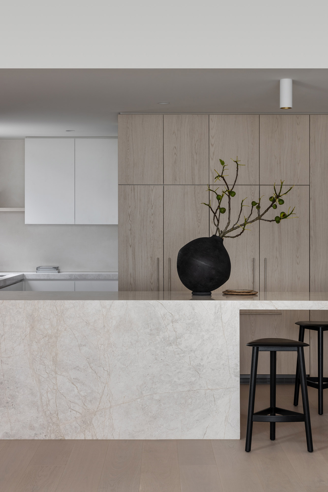
Next, I would like to share a beautifully designed real estate project by Mckimm Architects, which I found on The Local Project. It is an exclusive collection of apartments that are characterized by their well-thought-out interiors, the use of high-quality materials, and their sophisticated design.
The project comprises five larger residential buildings, designed to provide residents with a sense of home and luxury. The apartments are available with two to three bedrooms and offer flexible floor plans. In the interior design, the architects placed a particular focus on natural materials, and photographer Timothy Kaye has once again perfectly captured the elegant and aesthetic atmosphere of the project.
More photos and information: https://thelocalproject.com.au/articles/moda-three-by-mckimm-project-feature-the-local-project/
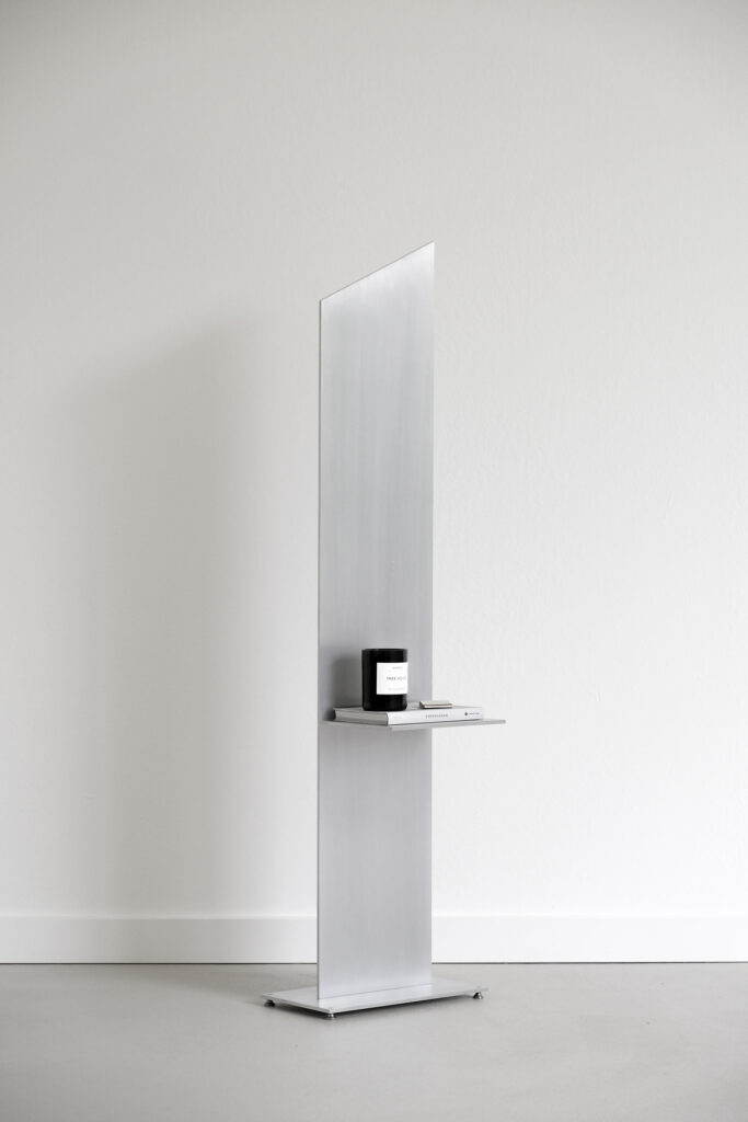
AL-01 side table by Orlando Pippig
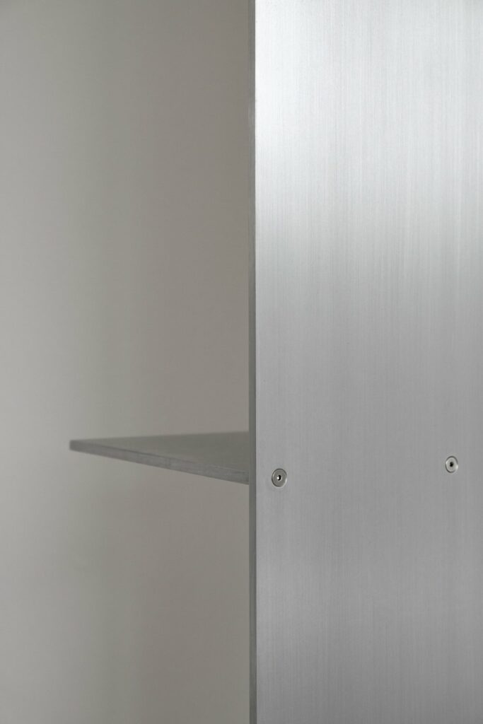
The AL-01 side table by New York designer Orlando Pippig is a minimalist design object that highlights the raw beauty of aluminum. With the side table, Pippig emphasizes his fascination with the material and its aesthetic and practical properties, and it is the first piece of an ongoing collection.
The side table’s clean, linear formal language gives it a bold, almost sculptural quality. The design consists of three planes: two horizontal and one vertical, which are joined together with stainless-steel fasteners. This practical construction not only makes it easy to assemble and disassemble the piece of furniture, but also emphasizes the durability and functionality of the design. Aluminum, often considered a cold and unfriendly material, reveals its aesthetic versatility with the AL-01 side table.
Read more about Orlando Pippig and his work here: https://orlandopippig.com/
Geometric Abstractions by Greg Dzurita
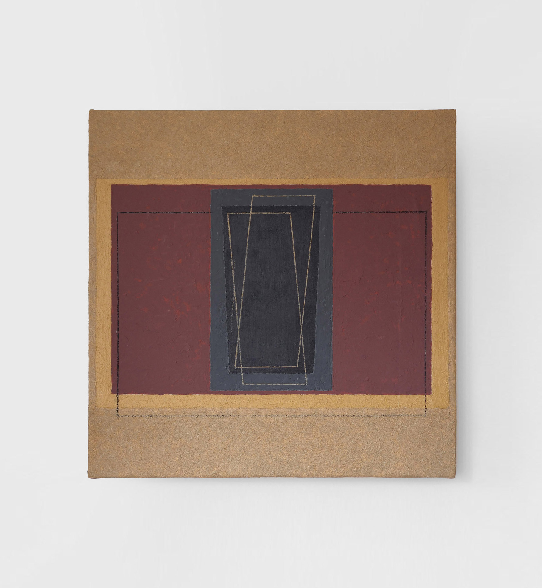
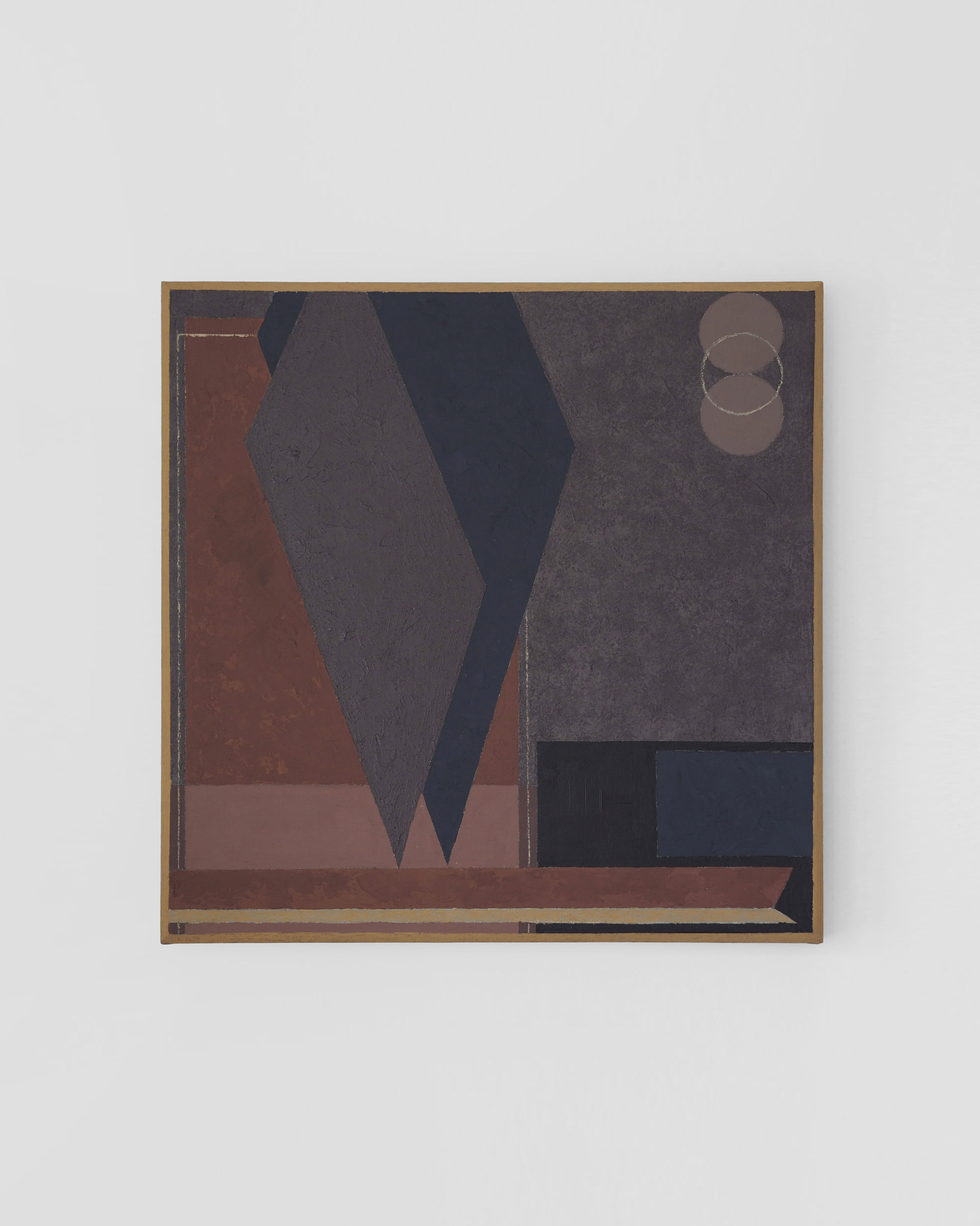
And to conclude this edition, I would like to share with you the abstract and geometric compositions of Greg Dzurita, an artist from New York City. Dzurita’s works are characterized by clean lines and precise shapes. The muted color palette, which consists mainly of earthy tones as well as blue and gray shades, creates a calming yet powerful presence. Dzurita uses materials such as clay, pumice stone and acrylic paints, giving the paintings a tactile depth.
Greg Dzurita explores the timeless language of geometric shapes in his works, which for him possess a universal visual language that conveys order and harmony. He relies on the timelessness of geometry to explore the connection between the natural world and the forms of architectural, man-made structures. His works are a balance between rigor and harmony, inviting the viewer to linger and contemplate.
More works and information about Greg Dzurita here: https://www.gregdzurita.com/
