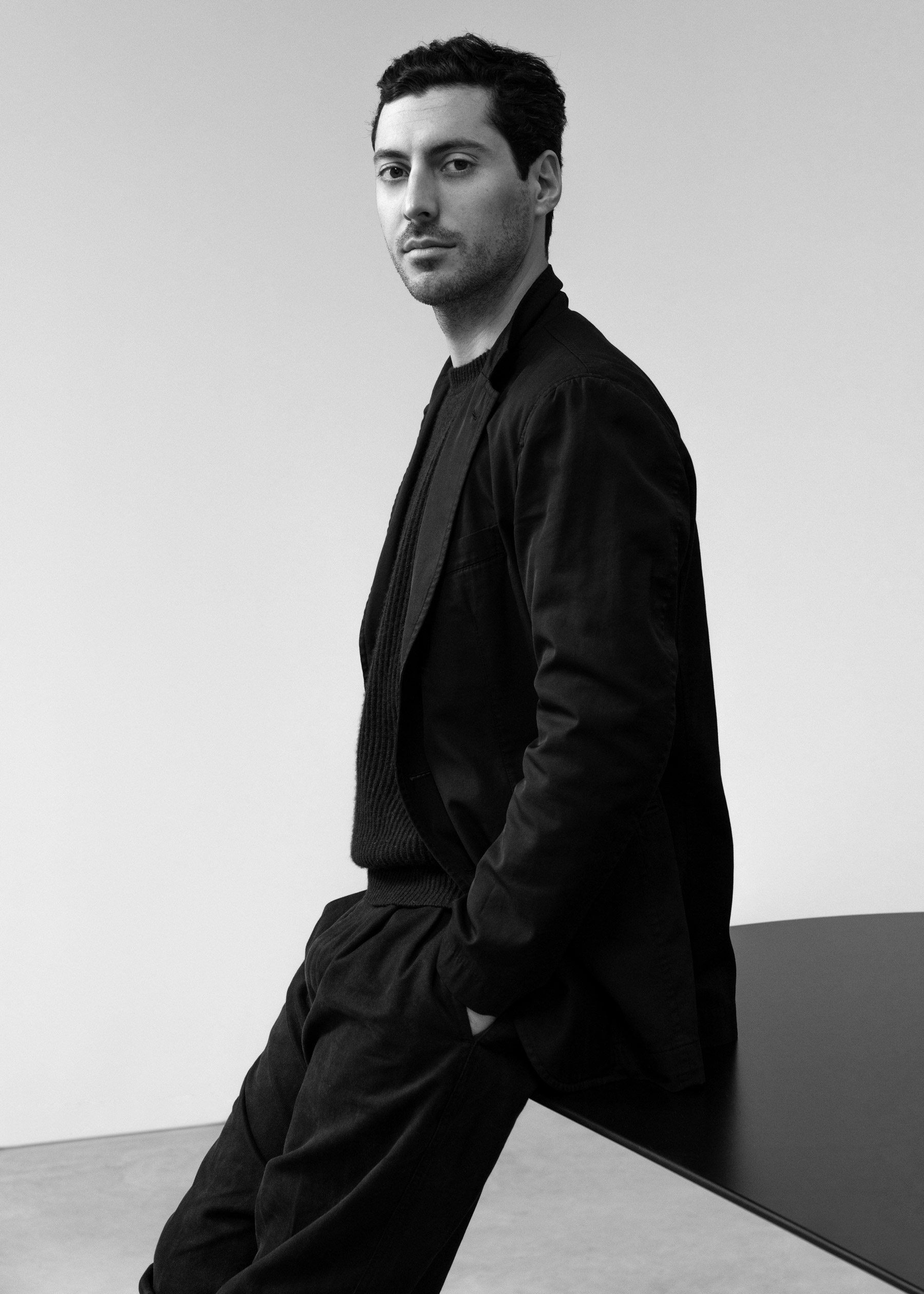
In the latest edition of our interview series, we once again dive into the world of minimalist aesthetics. In inspiring conversations with creative minds from the fields of architecture, design, and art, we explore how they are guided by their vision and how they express it in their works. Along the way, they provide us with interesting insights into their creative process and reveal how they perceive and shape the world. This time, I had the pleasure of having an inspiring conversation with Designer Guglielmo Poletti.
Guglielmo Poletti (b. 1987) is a Milan-based Italian designer whose work ranges from spatial interventions to furniture and lighting design. With a methodology that relies on the principle of “thinking by doing”, he develops his ideas in an experimental way, where intuition and then analytical thinking play an important role. This philosophy leads to designs that impress with their minimalist aesthetics and play with tensions and balances.
In this interview, he gives us an exciting insight into his personal design philosophy and aesthetics, reflects on the definition of good design and shares his fascination with balance and structural tension
Guglielmo, thank you for your time! Despite their reduced, minimalist aesthetics, your designs stand as metaphors of solved complexities. How would you describe your personal design philosophy and aesthetics and how do you find the balance between form and function in your design process?
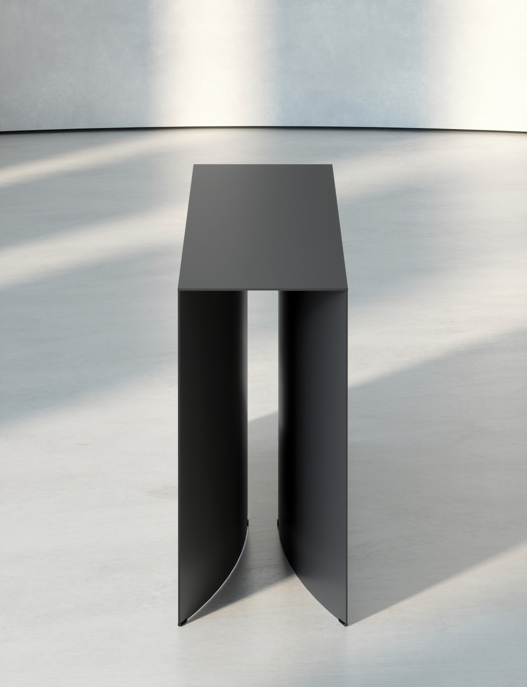
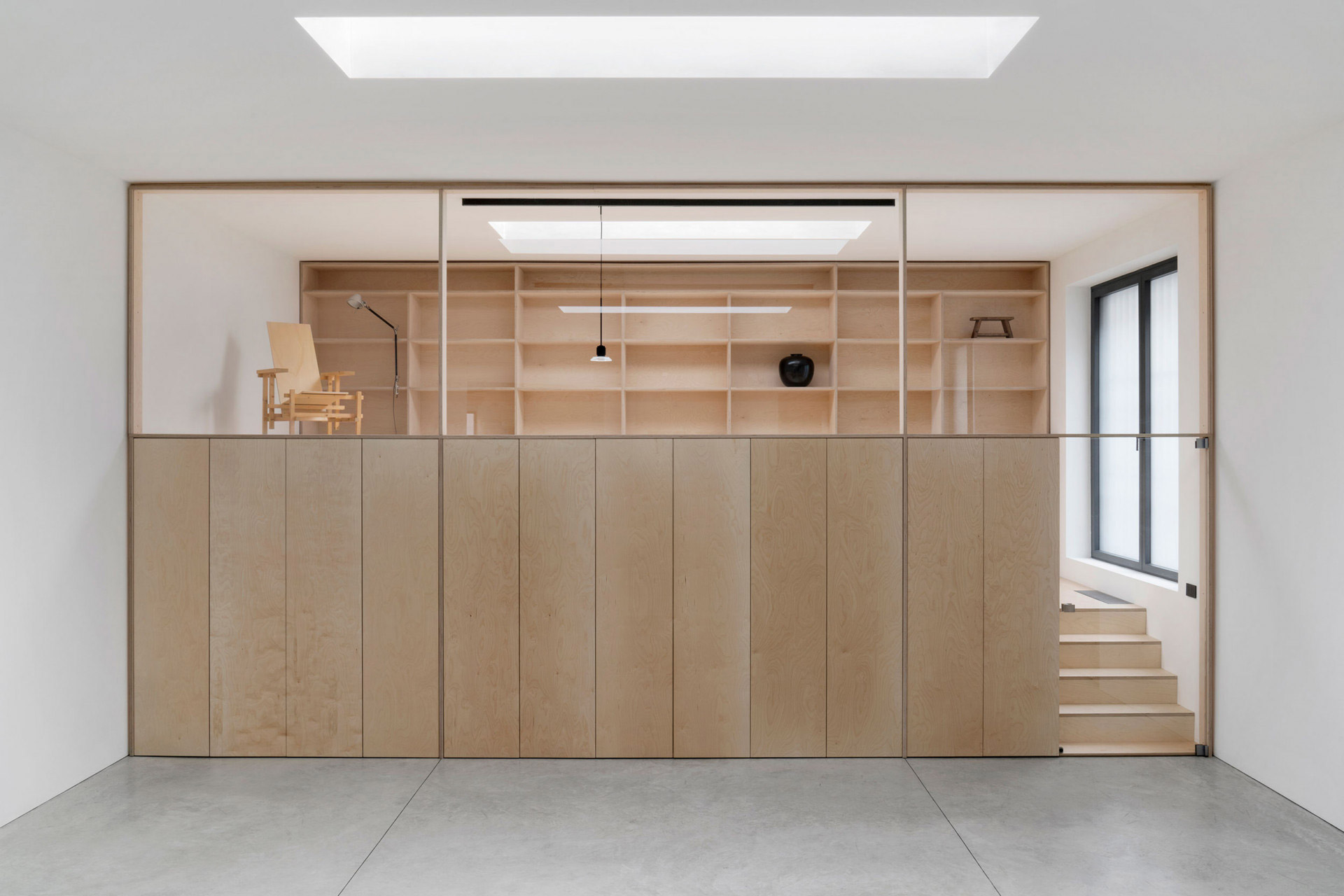
Generally speaking, I am interested in pursuing form through construction principles rather than defining aesthetics through stylistic design choices. I think that this approach, in a way, represents my attempt to come up with a language based on archetypal references. Whether I might be dealing with objects or with an architectural space, both the formal and functional qualities of the work are always informed by precise structural criteria. This undertaking is instrumental in highlighting the fact that aesthetics come as the consequence of something else, as my projects find their identity through the process, never beforehand.
What is your definition of good design?
Today I think defining what good design is might be challenging, since the contemporary discourse around the discipline is formed by many different interpretations of it, always requiring a proper contextualization. So I can only answer this question subjectively, according to a definition that resonates with my practice: good design should manage to be self-explanatory by incorporating several layers of meaning.
This characteristic is particularly precious to me, as it is strictly linked to the ingenious principle which often lays the foundations for a solid work, where the lack of arbitrariness makes room for design to become more universal. Simplicity also plays a major role in highlighting the core of a good idea, allowing the outcome of a design project to be bold and subtle at the same time.
Good design should manage to be self-explanatory by incorporating several layers of meaning.
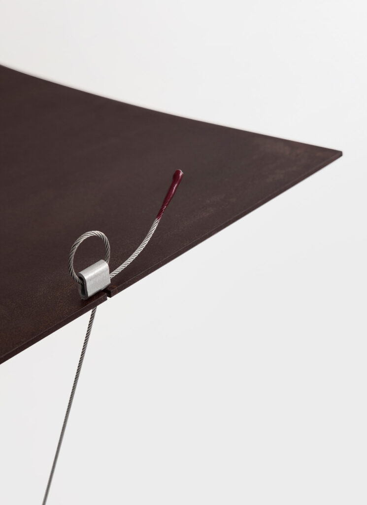
Balance and structural tension is a recurring element in your work. What fascinates you about it, and how does it influence your creative process?
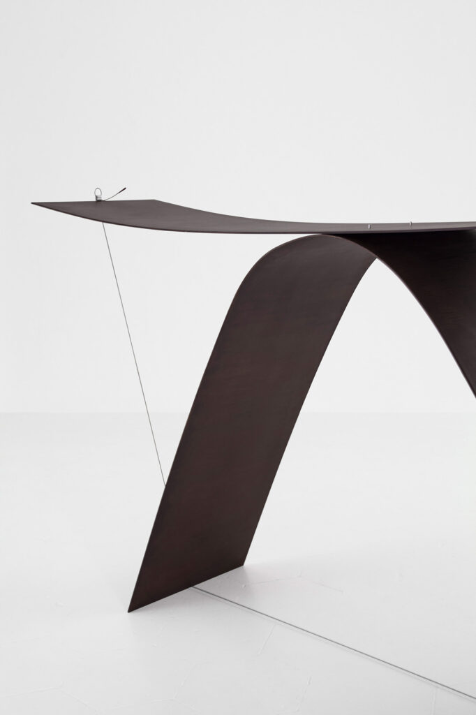
Structural considerations helped me to shape the criteria that have gradually become my guidelines, independently of the typology of the project I am working on. I don’t really try to include balance or structural tension into my work in a rational way, it is more of a fascination which is somehow innate.
These elements are naturally incorporated in the initial phase of the creative process, which is always led by an experimental “thinking with hands” approach based on physical study models, though which I try to find a single gesture that generates the detail around which everything else is basically implemented. It’s in this crucial phase that an idea sparks from intuition, relying on the unconscious first and on analytical thinking only later, in a secondary phase.
Throughout your career, you have worked with renowned clients and brands. How does working with such partners influence your design practice and how do you maintain your design vision and philosophy?
I think the most important aspect for me is the way the relationship with a new brand starts: it should happen naturally, in order to ensure it is coherent with the designer’s independent vision. When the circumstances are aligned with this premise, it becomes much easier to stay true to your philosophy throughout the development stages of an idea.
This is especially relevant for me, since I am not a designer who always feels comfortable in responding to briefs – I engage in a continuous exchange with my clients, but the starting point is often independent of them. Consequently, a good deal of my projects are self initiated, including the ones for the industry. But as I get more experienced, I start to value more and more the first inputs coming from the companies which, together with a high degree of technical expertise, often open up new points of view that can enrich my perspective and generate totally unexpected outcomes.
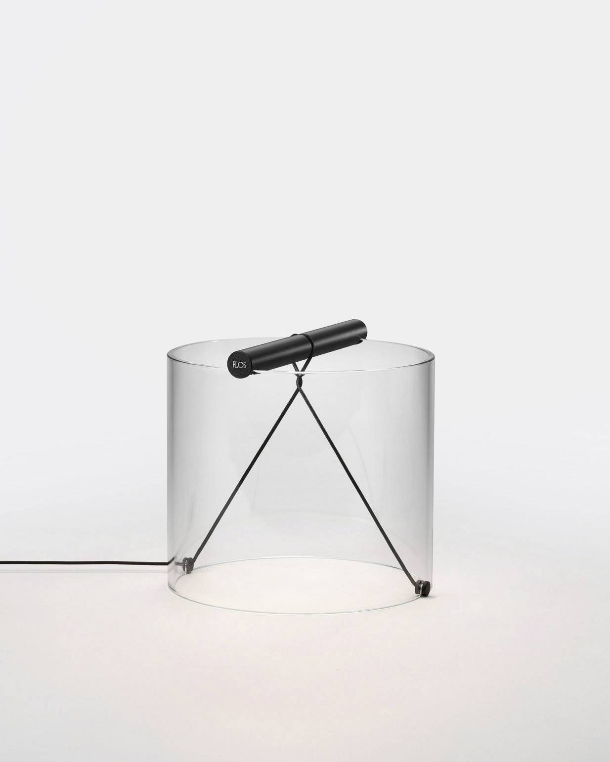
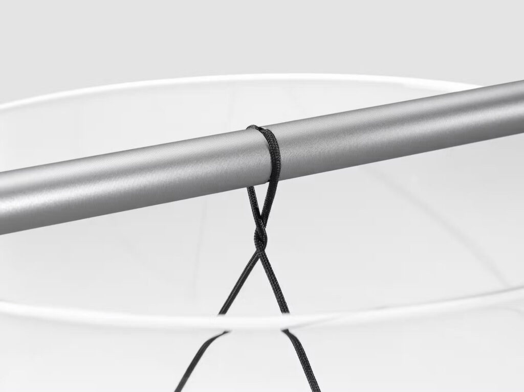
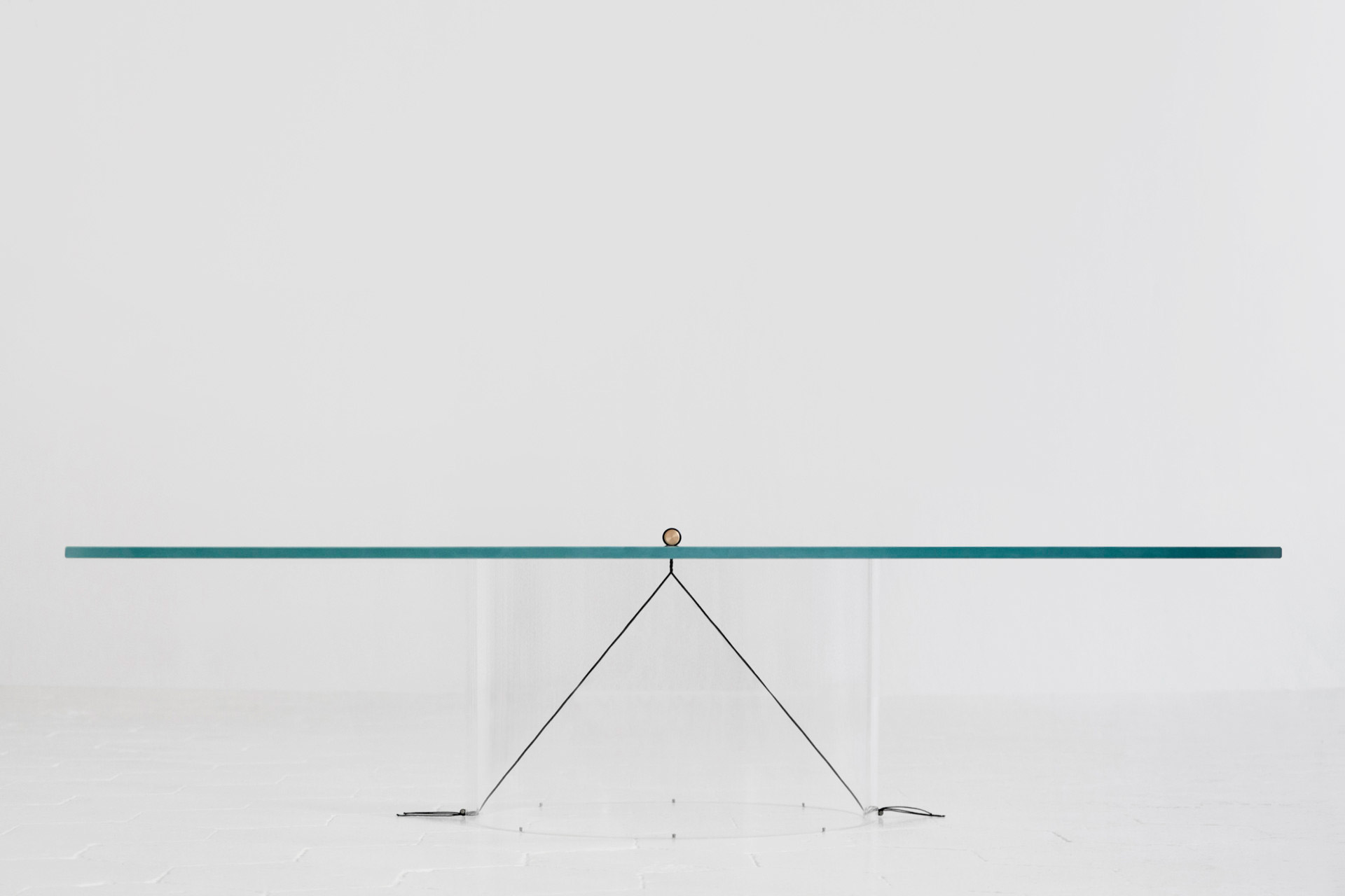
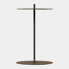
Tell us more about the To-Tie lamp you designed in collaboration with Flos and the concept behind it. How did the idea come about?
The lamp came out of a big detour: the idea for To-Tie started from the Equilibrium Low Table, part of my 2016 graduation project at the Design Academy Eindhoven, which I initially reworked completely into a suspension light. But that first prototype made by Flos didn’t satisfy our expectations. After a while, while working on some other proposals, I went back to the concept, and made a new prototype of the lamp as a table version.
I thought it was interesting to work on the idea of the joint, which was an integral part of the new prototype: a small acrylic cylinder with a rudimentary LED, that I made myself in my workshop. When I turned on the lamp’s prototype on my worktable, I immediately understood it had some unique qualities. I didn’t imagine it rationally: once again, it was the process led by my hands that played the major role.
How important is sustainability in your practice, and how does it influence your decisions in material selection and construction?
Today there are some key issues that must be addressed and taken into consideration while producing an object on an industrial scale. The clients I am lucky enough to collaborate with all do an excellent job in this regard, ensuring that both the materials sourcing and the manufacturing processes are oriented towards sustainable environmental policies.
A designer’s responsibility is to provide the company with the correct inputs, especially in relation to the assembly and dismantling of the objects, to simplify both the possibility of repairing them or dispose them at the end of their life cycle.
Simultaneously, I think some other factors can contribute to raise more awareness about the meaning of production nowadays. We all struggle to deal with a frantic, oversaturated and quantity-focused market, while I am personally convinced that quality needs slowness and time. So, to make a good product, both the company and the designer need to be brave enough to patiently question their ideas, polishing them until the moment they are sure their production is truly worth it. In my opinion, this step is essential in order to embrace a more holistic attitude towards the logics dictated by the market.
To make a good product, both the company and the designer need to be brave enough to patiently question their ideas, polishing them until the moment they are sure their production is truly worth it.
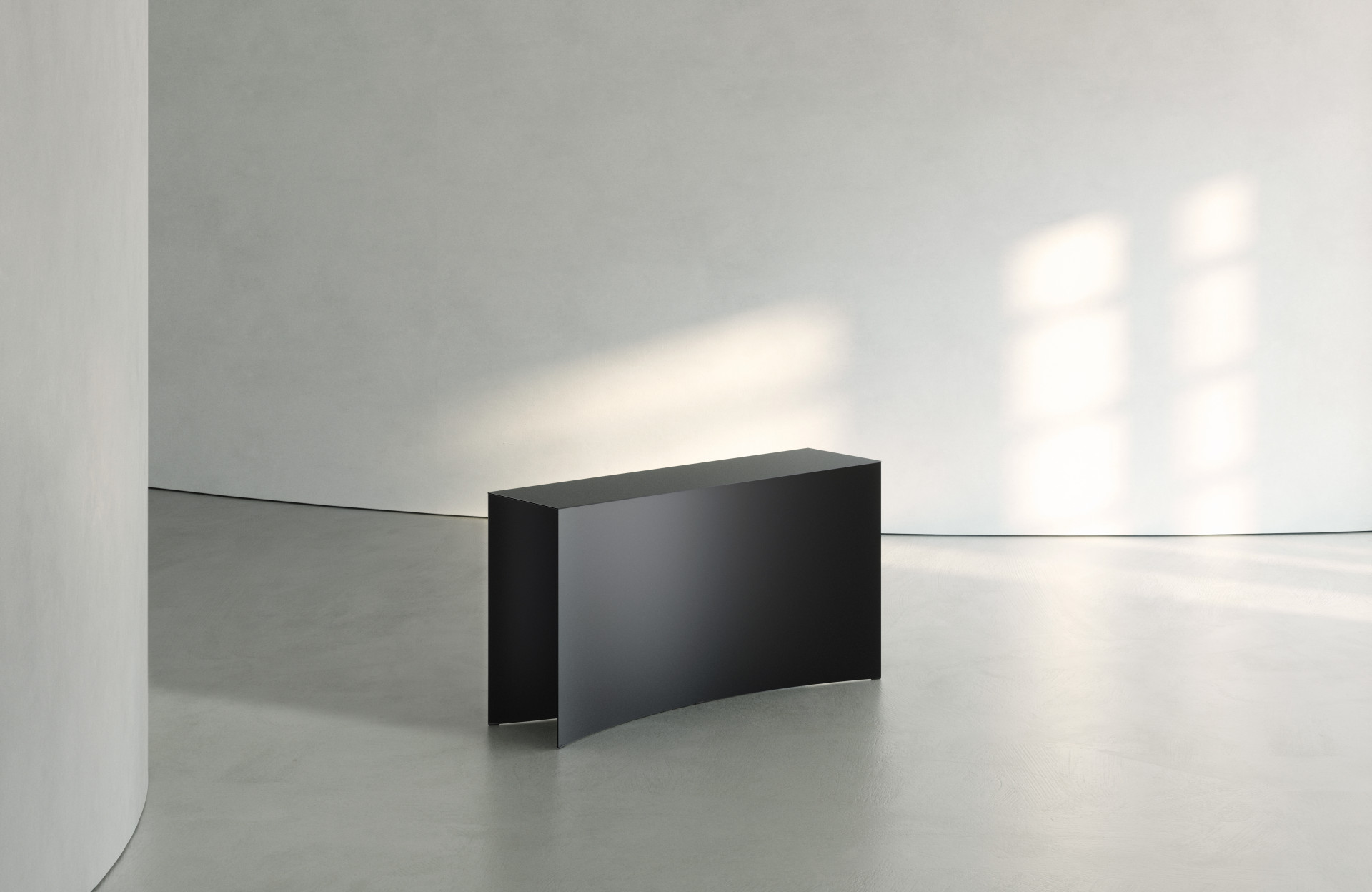
How do you see yourself and your work in the future? Are there particular projects, techniques, or materials that you haven’t worked with before but would like to explore?
During the last year, I have been working on self-initiated and privately commissioned architectural interiors. This entailed great commitment, crafting spaces with meticulous attention to detail, akin to the precision required in designing the projects for my own studio unit. It’s a direction that absorbs a considerable amount of energy, implying a collaborative effort with architects and many other professional figures.
Looking ahead, I am still very interested in the field of lighting, as it strikes the perfect balance between poetry and technique. So my wish is to keep exploring new possibilities together with a great partner like Flos.
Finally, I am glad to be back to furniture design thanks to a new industrial partnership with Italian company Magis. On the occasion of the upcoming Salone del Mobile Milano we will present a collection of mirrors made of extruded ceramic – a new material I never had the chance to experiment with before.
Magis is a great partner with whom I am establishing a very productive dialogue. Right now, we are trying to push the boundaries of design by engaging in truly innovative experimentation with different furniture typologies. So I hope this first project will be the first of a long series, which I might be able to unveil in the coming future.
Thank you very much for your time, Guglielmo!
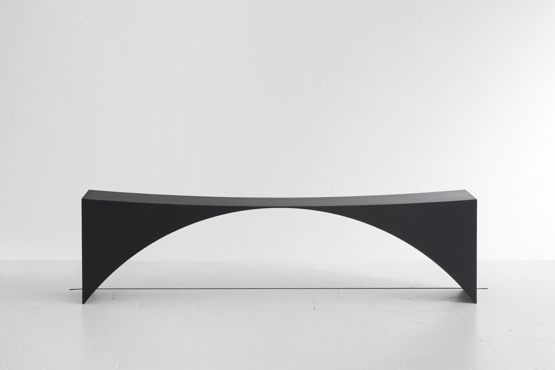
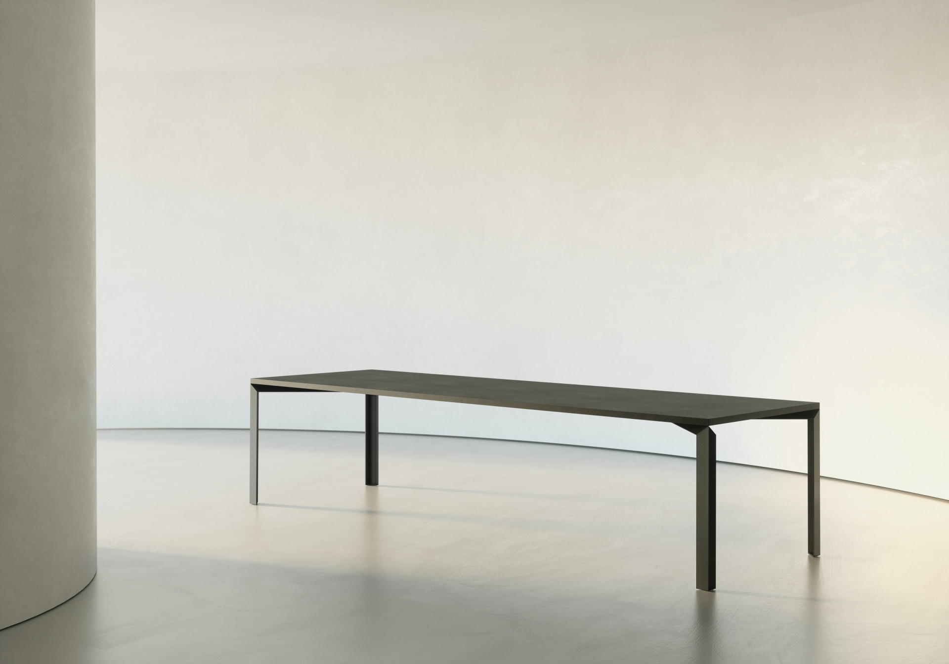
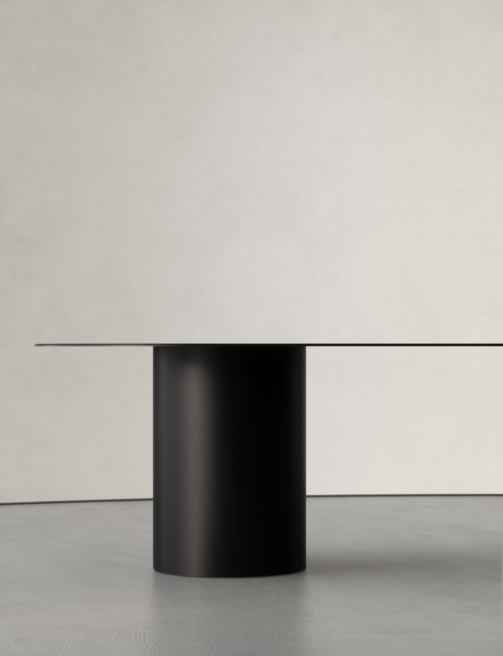
More about Guglielmo Poletti
https://guglielmopoletti.com
https://www.instagram.com/guglielmopoletti/
Designer Portrait at Flos: https://flos.com/en/us/designers/guglielmo-poletti.html
