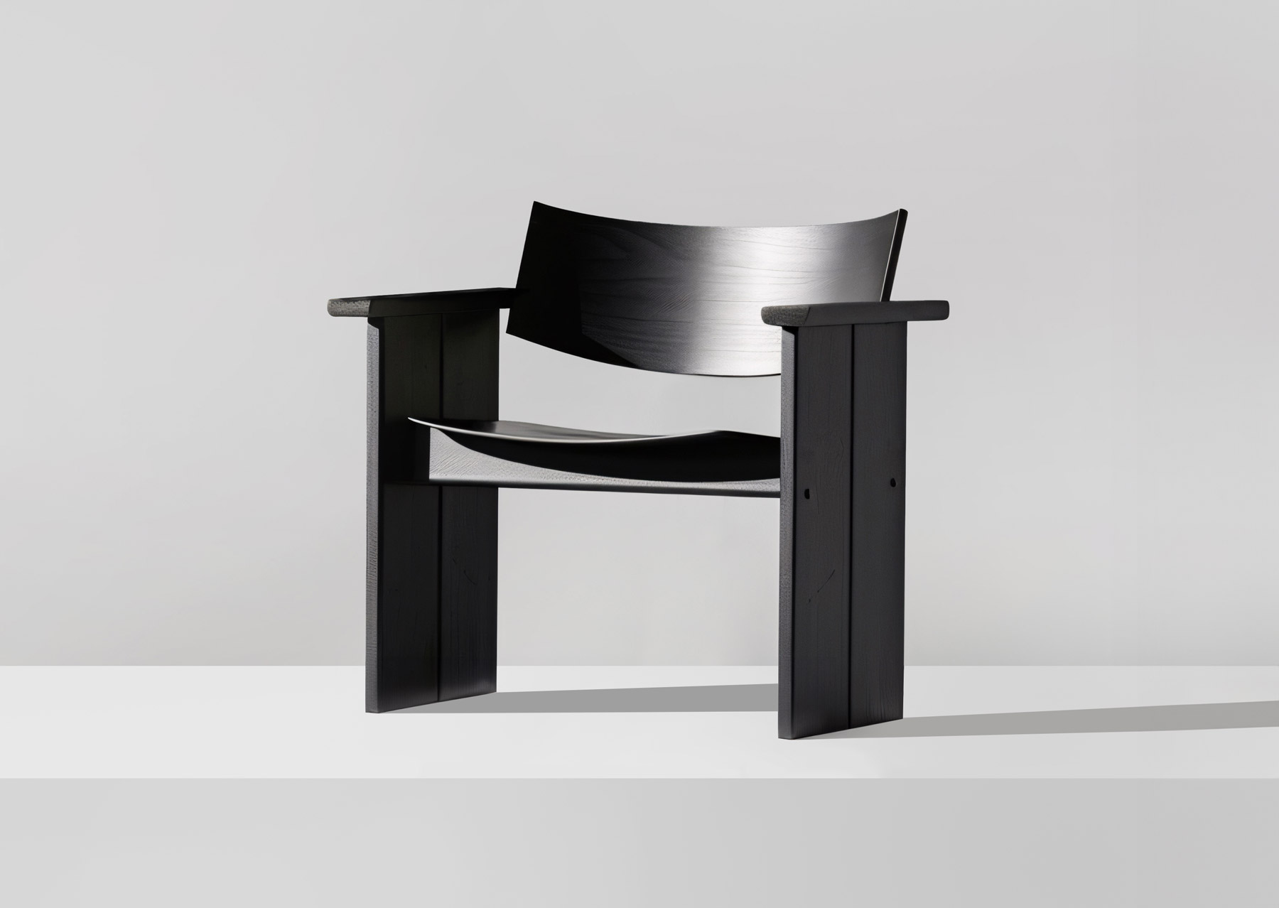
“Less is more” – this phrase coined by Mies van der Rohe has long established itself beyond the boundaries of architecture. It has become a guiding principle for a whole generation of creatives working in various disciplines. Influenced by brands like Apple, minimalist design has particularly become a symbol of innovation, quality, and user-friendliness in the past 15 years. However, with growing popularity, the uniqueness of many products has increasingly faded.
Therefore, I ask myself the following question: How can design that is reduced to the essentials stand out in a sea of similar-looking products while maintaining its uniqueness? Where is the line between a reduced design language and the loss of originality? Does minimalist design even mean a loss of identity?
In one of my last essays, I briefly touched on this topic and asked what role aesthetics play in this context. In a world where we are flooded with products and visual stimuli, aesthetics is no longer just a question of taste – it has become an indispensable factor in the success of a product. It influences the beginning of our interaction with an object and our emotional relationship with it. But what if the aesthetics become confusingly similar due to minimalist design principles?

Perhaps a look beneath the surface of a design could provide an answer. What do I mean by that? Minimalist design should not just be the elimination of unnecessary elements. As always, it’s the details that matter. As Charles Eames already knew: the details are not just details, they make the design. Minimalist design is a philosophy that consciously focuses on the essence of a product. Who should use the product? What values should it convey? What should the product stand for? And what purpose should it fulfill? How does its form communicate its function? Which materials are important?
Minimalist design should be the result of an ongoing dialog between designer and user, between innovation and tradition, between intuition and analysis, and not simply a set of principles that should be bluntly applied. Because a well-considered concept and vision for the product gives the design substance and thus originality. The key to uniqueness lies in the in-depth consideration and individual interpretation of the above-mentioned aspects. If this is implemented, every design can tell its own story and develop its own identity.
The essence of Minimalism is simplicity, but simplicity without depth is merely cheap. It is not enough.
Tadao Ando
But let’s get back to my question from the beginning: why do so many minimalist designs look the same? Well, this question is easy to answer: Because often only the superficial aesthetics are imitated without the designer having looked more deeply into the essence of the product. As Tadao Ando said so well: “The essence of Minimalism is simplicity, but simplicity without depth is merely cheap. It is not enough.”
The result is then a flood of visually similar products that are very likely to differ in their functionality and core, but do not communicate these differences clearly through their design. Minimalist design should therefore never just be an aesthetic decision, but a consciously chosen reduction to the substance and essence of the product – only then it can retain its originality. But that’s just my humble opinion on the subject.
How do you see it? Does minimalist design mean a loss of identity for you or exactly the opposite?
Further Reading:
- https://www.slice.marketing/sliced-and-diced/the-danger-of-minimalist-design
- https://www.quora.com/Why-is-minimalism-so-famous-in-current-design-trends-Is-it-because-its-easy-What-is-the-train-of-thought-when-coming-up-with-minimalist-designs
- https://www.toptal.com/designers/ui/maximalist-design
- Article: Is Aesthetics The New Function In Design? https://www.aesence.com/aesthetics-new-function/
About Exploring Aesthetics:
Sarah loves asking questions and exploring the things she engages with on a daily basis. Exploring aesthetics is her column which discusses art, design, and aesthetics to explore, inspire, and question the status quo.


