The internet is full of inspiration. Every day I discover beautiful art, design, and architecture – but often these little treasures get lost in the digital clutter. With ‘The Edit’ I want to share a carefully curated selection of outstanding artworks, stunning architecture, and inspiring designs that catch my eye in my daily research.
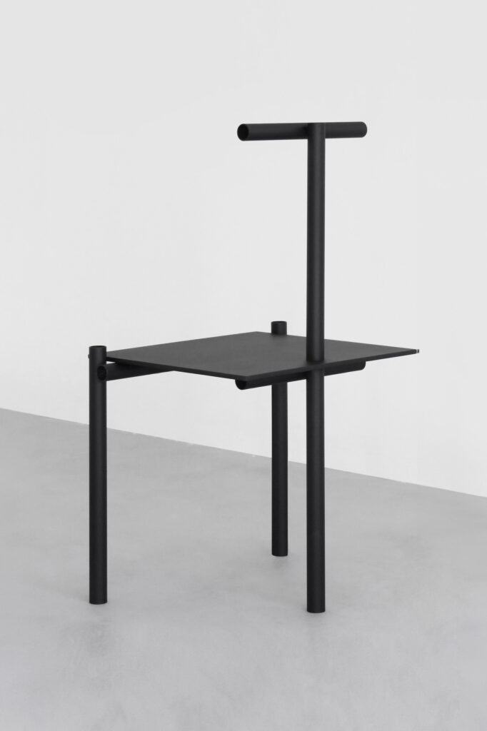
Let’s start with some random inspiration. What immediately stands out in all of them is the straight and linear design. The first object (Image 1) is a unique piece by Studio Fax. The chair captivates with its unique aesthetics and minimalist design language. The studio, a multidisciplinary design office based in London, designed the chair in 2020. A unique feature is the rear part of the chair: the backrest also serves as the rear leg, while the two front legs provide stability. The chair is made of black-coated, welded steel.
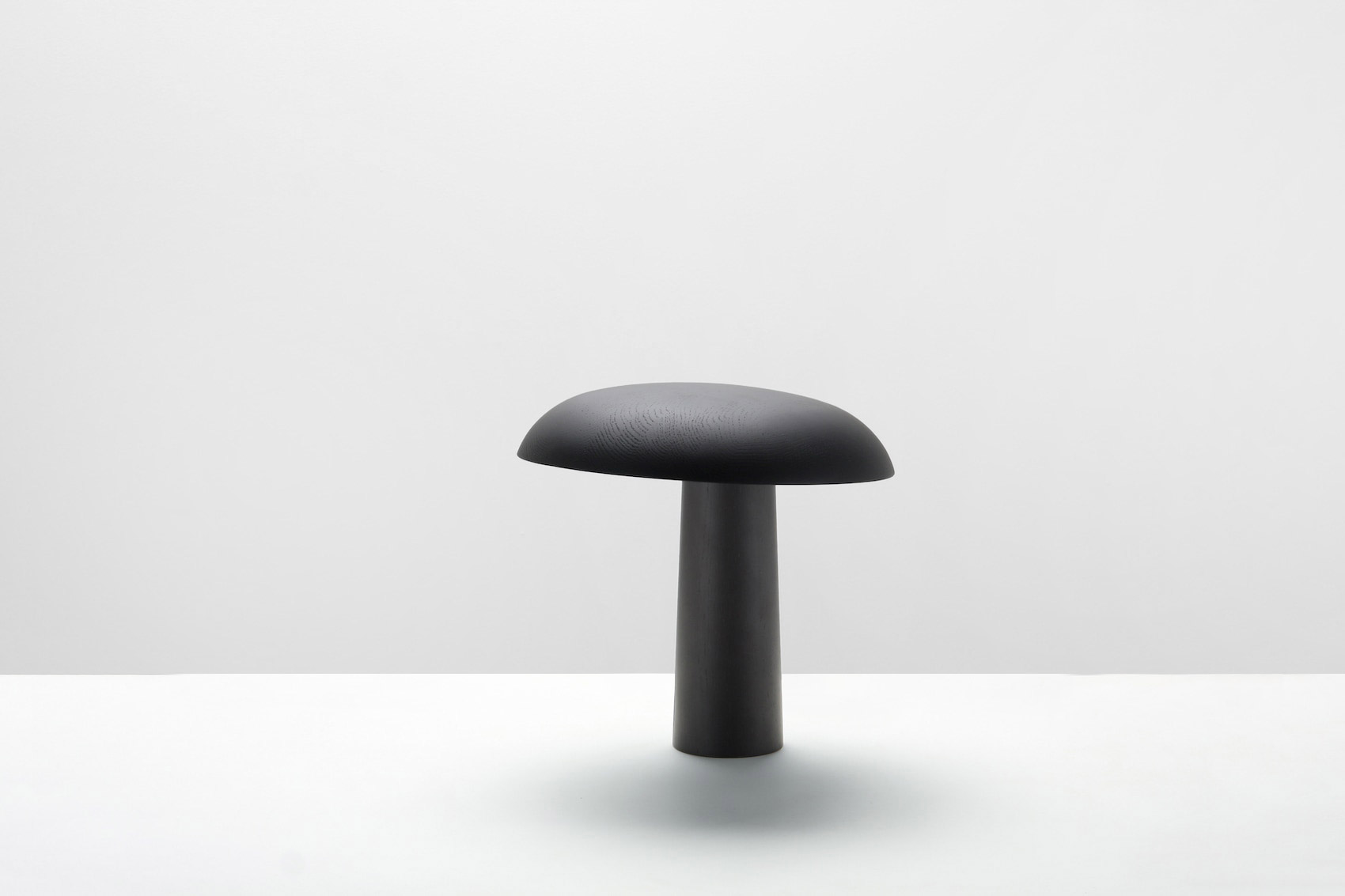
In the third image, we can see the minimalist CHL01 table lamp by German designer Christian Haas from 2019, which he designed for Karimoku New Standard. Haas is known for his harmonious aesthetic, which is characterized by simplicity, utility, emotionality, durability, and distinctiveness. The luminaire impresses with a clean silhouette that draws focus to its sculptural form. Its design is based on the typology of industrial table lamps, while its asymmetry provides a modern twist.
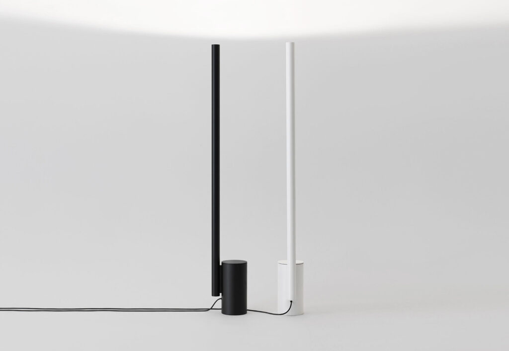
The w164 Alto (Image 3) is a perfect example of the use of indirect light. Reduced to the absolute essentials, the design consists of two cylinders that form a closed, discreet unit. German designer Dirk Winkel created the clear design language, inspired by Brutalist and Deconstructivist architecture. His belief in the formal beauty of purism and the principle of “less, but better” clearly informs Winkel’s design approach.
JPS Gallery/Workshop by Deza Setién
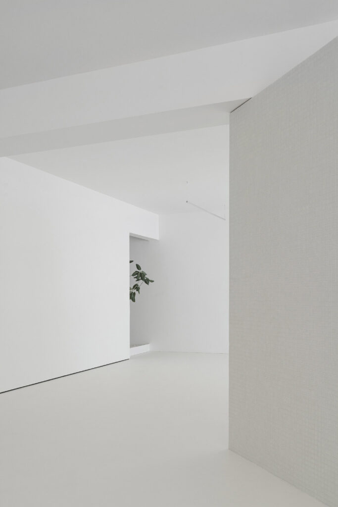
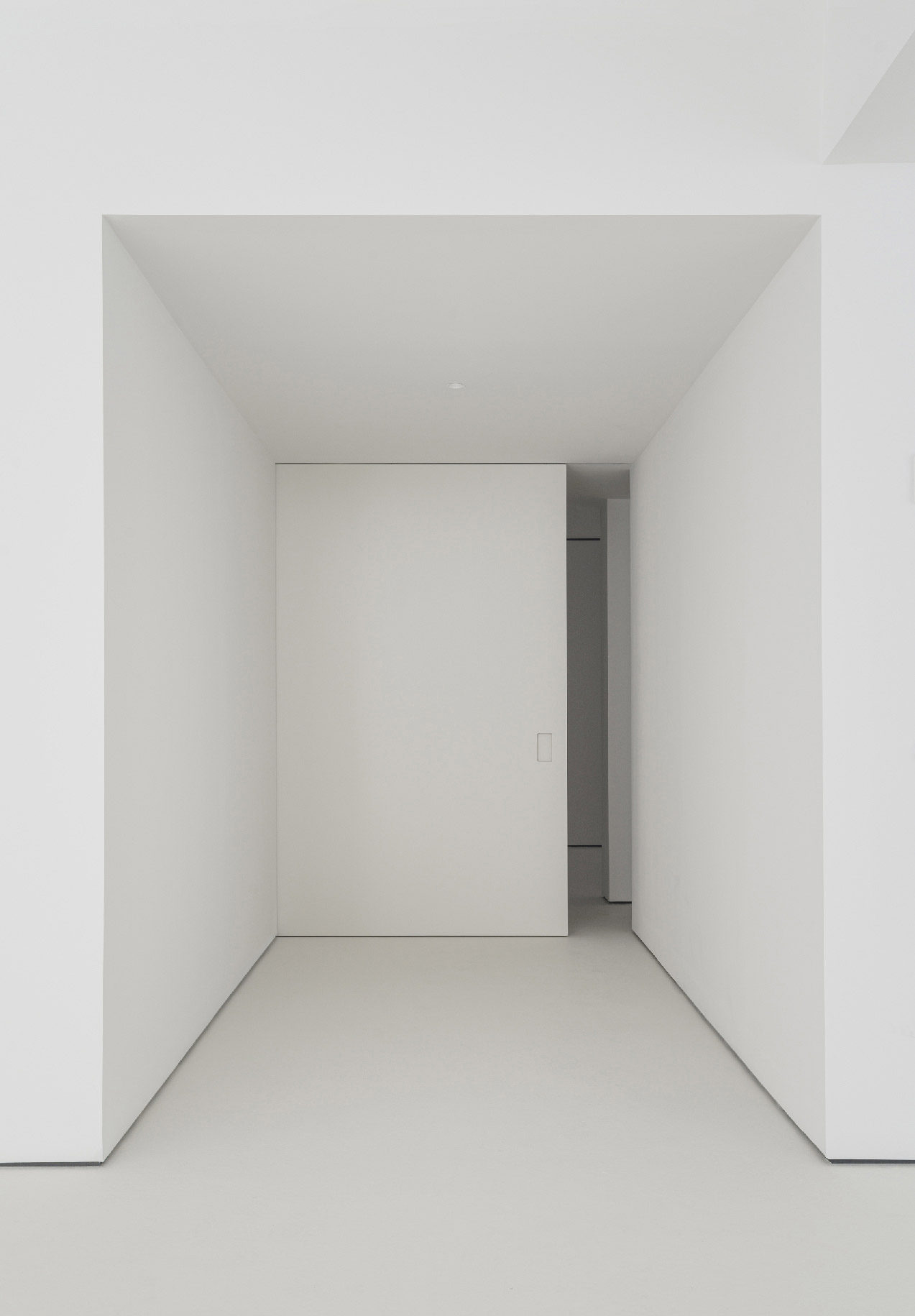
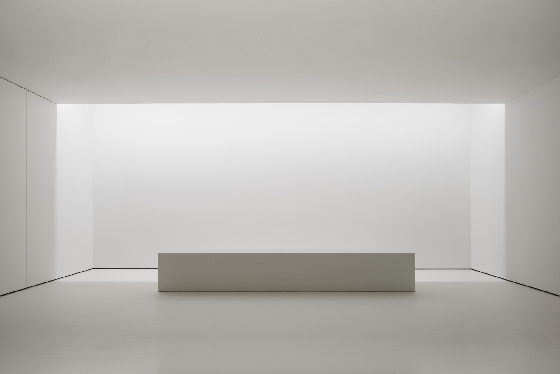
Architect Deza Setién has completed a beautiful design for the new headquarters of JPS Gallery/Workshop in Barcelona. The theme of the design is stillness – because only the art to be displayed there later should serve as a distraction. And he succeeds in doing just that. The minimalist interior of the building is coherent and clearly divided into three areas: The exhibition area for the artworks, a workshop and a service area. A central corridor connects these areas.
The workshop area is symmetrically designed and is divided into two equal halves by a support beam that runs across the room. A central volume, which is rotated 45 degrees to the beam structure, subdivides the room in an unobtrusive way. Cutouts in this element allow for a spatial connection between the areas and direct natural light into the entire workshop.
The atmosphere that Deza Setién has created with his design is unique. The soft light and the minimalist aesthetics leave a lot of room for the art and create a calm and special mood. The photographer David Zarzoso captured this remarkably well.
Osaka Bench by Studioutte
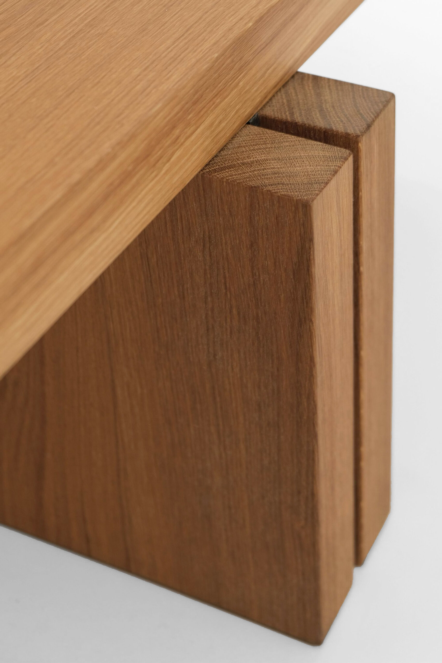
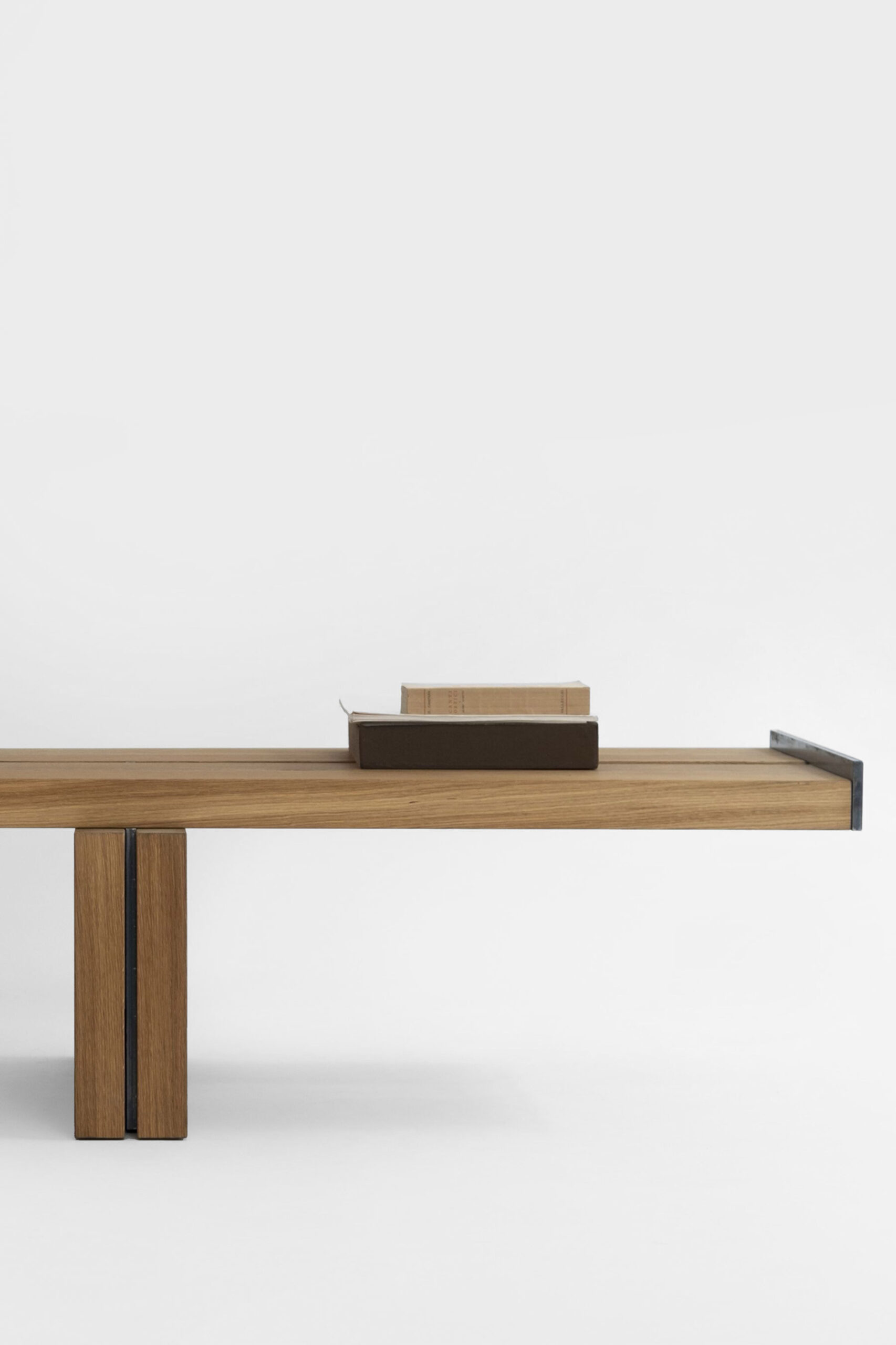
Studioutte designed the minimalist “Osaka” bench, inspired by the concept of torii, the Japanese temple entrance gate. The legs extend elegantly beyond the seat edges and metal spacers connect the ends of two parallel boards that form the seat. The Milan-based firm was founded in 2020 by Guglielmo Giagnotti and Patrizio Gola. Their designs focus on the purity and original essence of objects and spaces, always influenced by vernacular architecture and regional practices. The Osaka Bench, made of solid oak, skillfully combines the reduced and light design language and its high-quality, solid materials.
