The internet is full of inspiration. Every day I discover beautiful art, design, and architecture – but often these little treasures get lost in the digital clutter. With ‘The Edit’ I want to share a carefully curated selection of outstanding artworks, stunning architecture, and inspiring designs that catch my eye in my daily research.
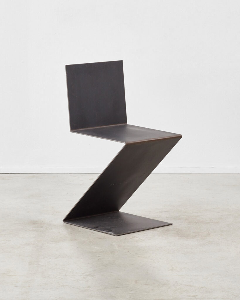
Let’s start with some random inspiration. The first set of images is under the concept of “contrast”. I found this inspired version of the ZigZag Chair in image number one at Beton Brut. Unlike the original from 1932, this chair is made from a single 5 mm thick sheet of steel bent into a zigzag shape. It’s a nice alternative to the wooden version, in my personal opinion.
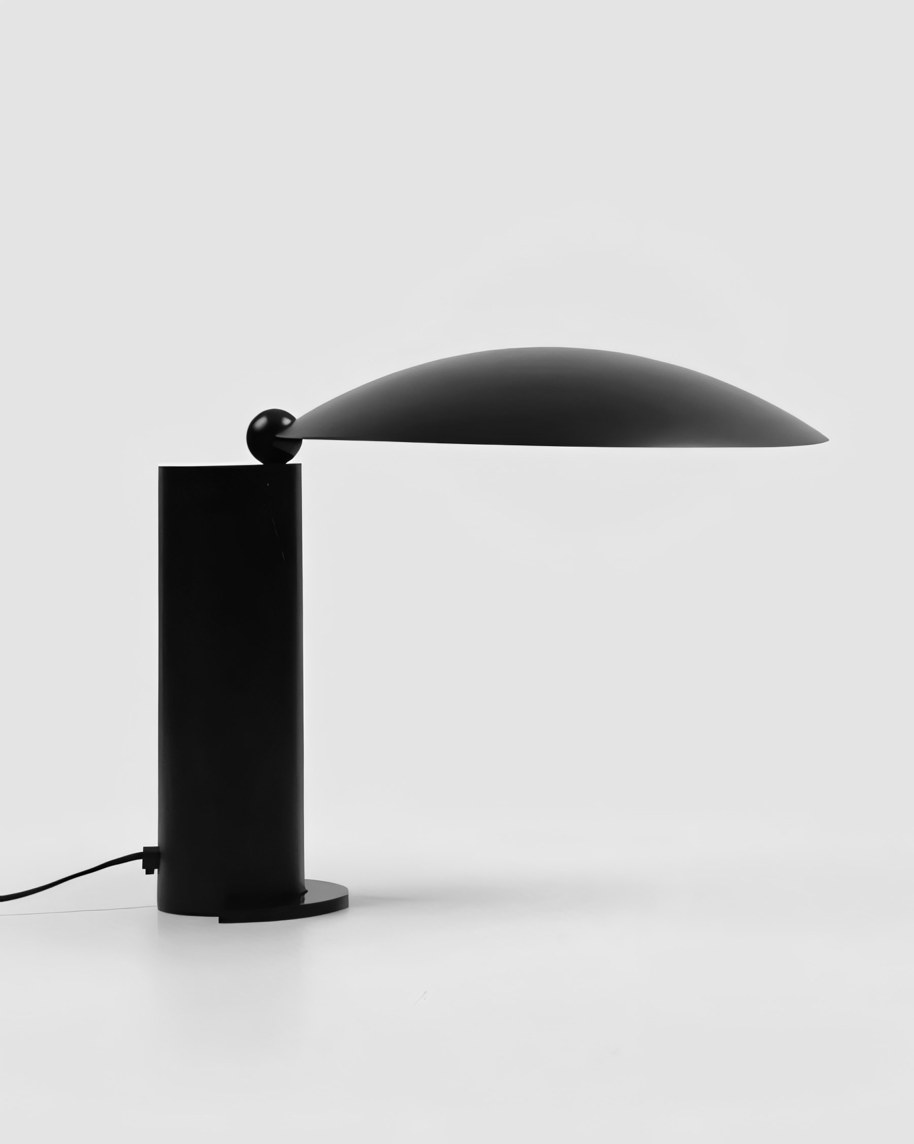
In contrast to the angular edges are the soft curves of the Washington Lamp by Jean-Michel Wilmotte from 1983 (image 2). The lamp, which Wilmotte designed for the French embassy in Washington DC, consists of a round base on which a thin convex lampshade rests. The two elements are connected by a small ball that allows the shade to rotate 360 degrees.
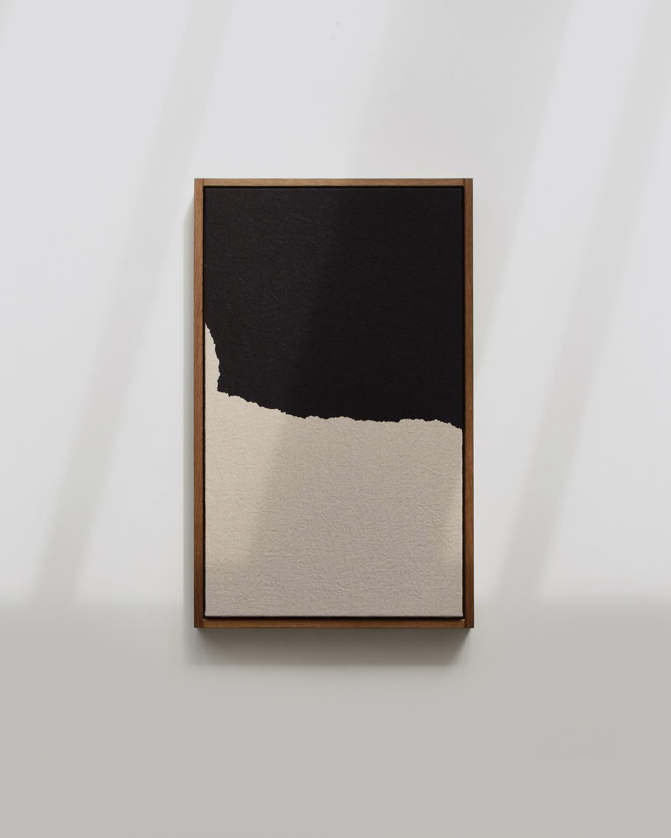
And the third picture is a painting by Scottish artist Hayley McCrirrick. Inspired by the silhouette of nature, the work captivates with its clear lines and strong contrast between the black color and the natural linen canvas. For McCrirrick, who has a degree in textile art, dip-dying and natural dyeing is a meditative process. She uses traditional craft techniques and seeks to create works that are rooted in the landscape and irrelevant to time.
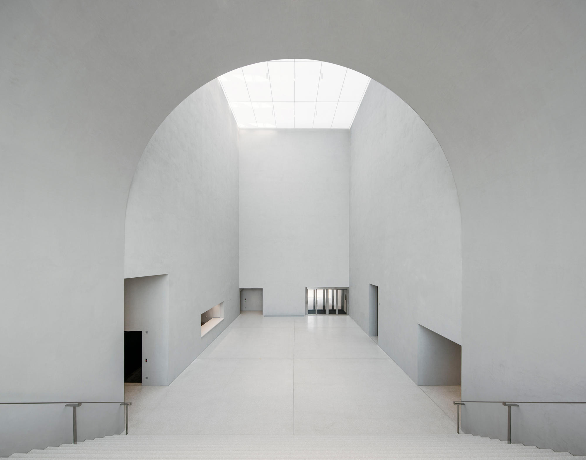
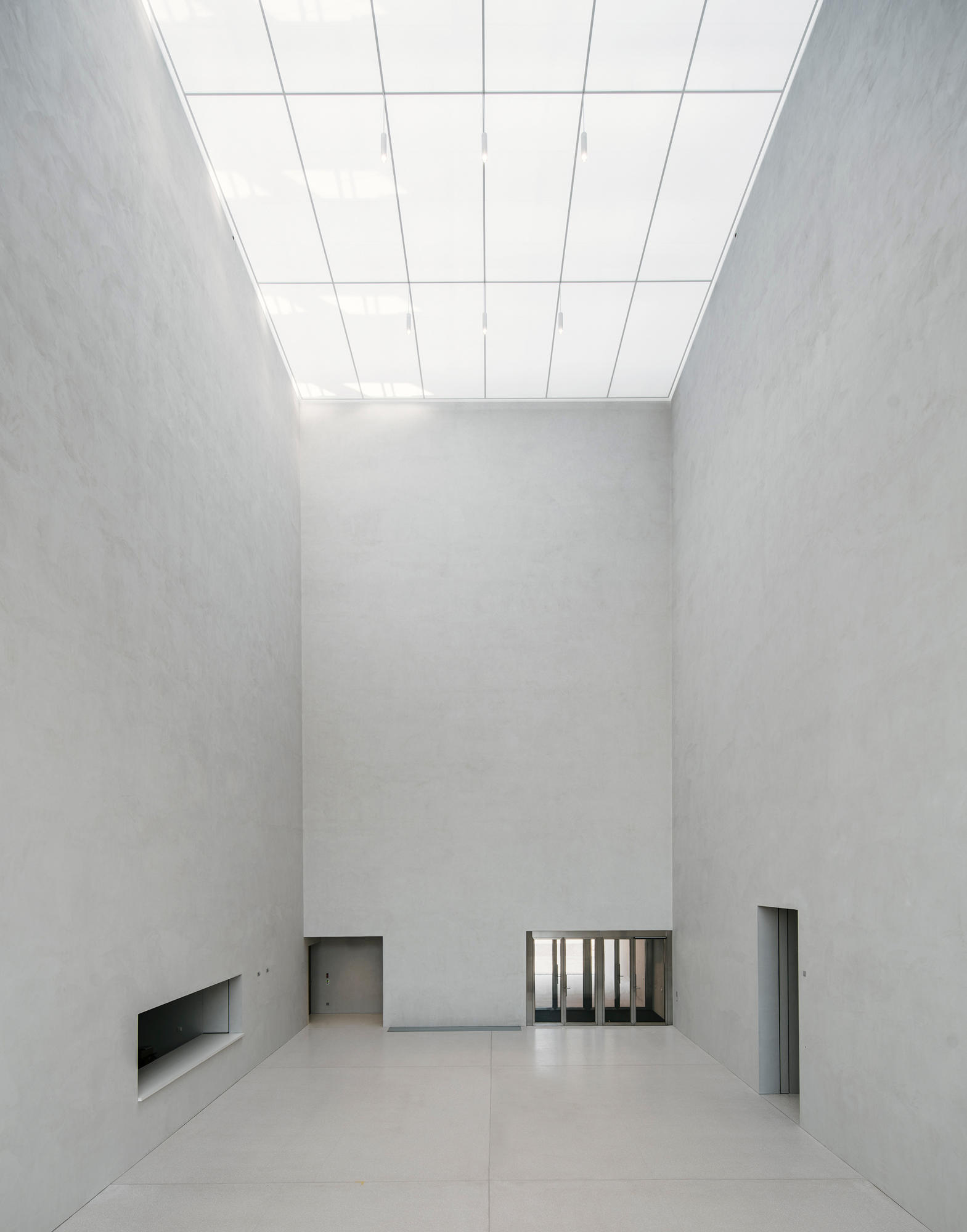
Musée Cantonal des Beaux-Arts de Lausanne by Barozzi / Veiga
The next project I would like to share with you is the Musée Cantonal des Beaux-Arts de Lausanne, which impresses with its minimalist design and straightforward, monolithic structure. In 2011, the architecture firm Barozzi / Veiga won the international competition to design the new art district in Lausanne and the design of the art museum.
The building is located on a site of over 2 hectares, which is mainly occupied by an old 19th-century railroad hall and other industrial buildings. The museum extends over three floors, connected by a central foyer. The main entrance leads into this foyer, which is covered by an enormous skylight (see photos). Photographer Simon Menges has captured this impressive architecture superbly.
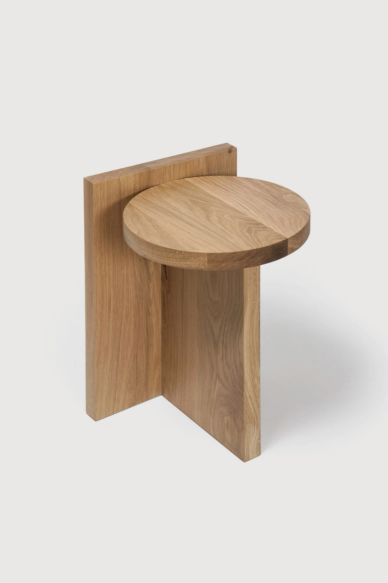
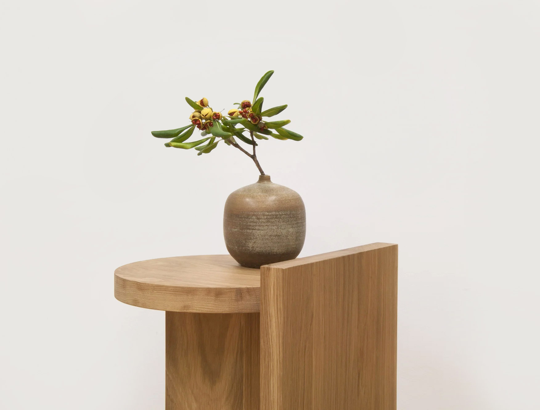
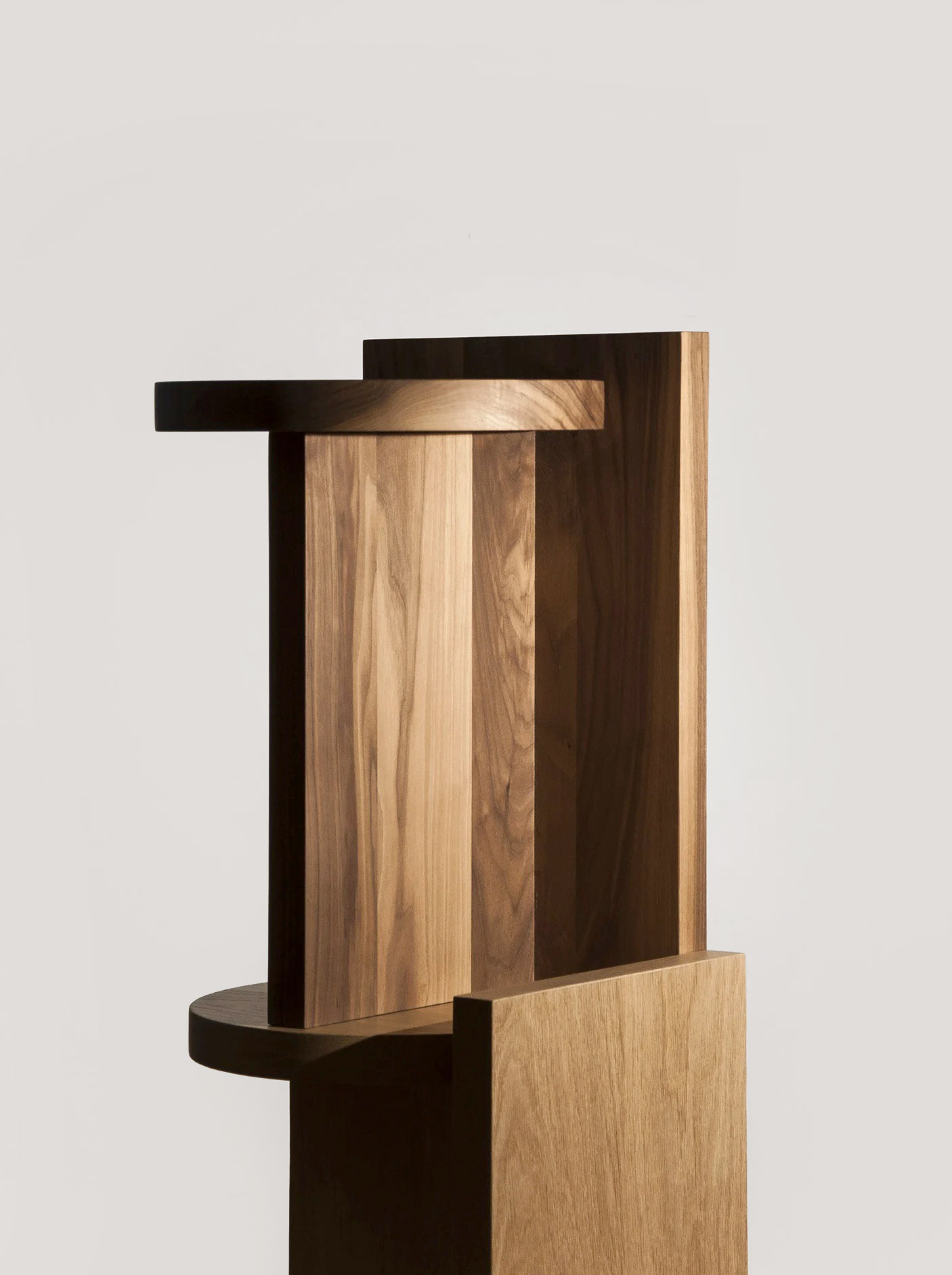
Taco Oak Side Table by GOFI
Taco by GOFI is a minimalist piece of furniture made of high-quality solid wood. According to the Spanish dictionary, a “taco” is a short and thick piece of wood that can be used in many ways – and that describes the piece of furniture perfectly. Taco consists of three pieces of solid wood that can be used as a small table, stool or in other ways.
Taco was designed by Álvaro Goula and Pablo Figuera. The two founded GOFI in the summer of 2015 with the clear goal of creating bold and creative designs that clearly stand out from other brands. They place great value on the shape and aesthetics of the objects, the material, the manufacturing process, and the usability of their products.
Random Inspiration
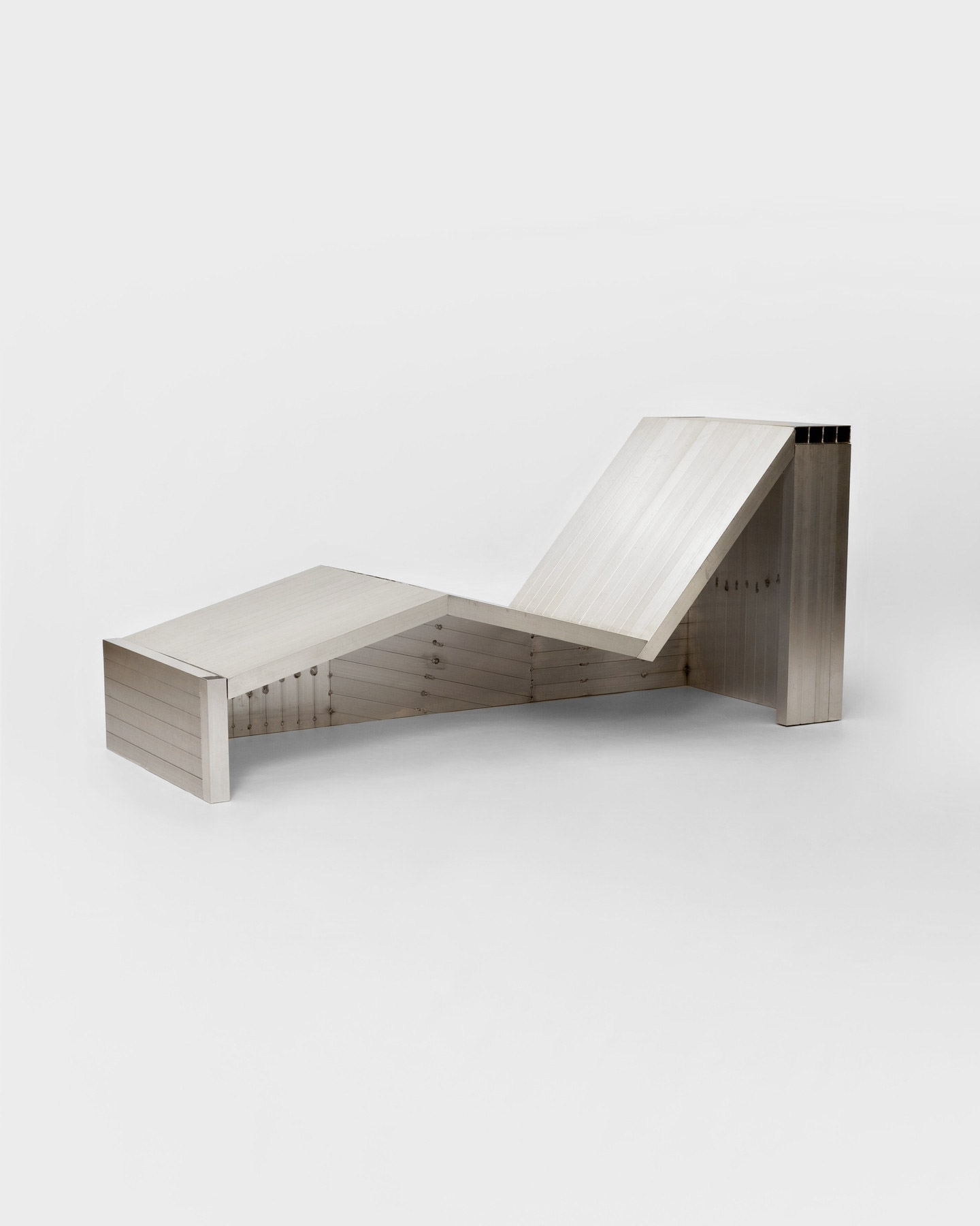
Image no. 4 shows a lounge chair designed by Studio HAOS. The chair is made of waxed aluminum and immediately catches the eye with its straightforward design language. Studio HAOS was founded by Sophie Gelinet and Cédric Gepner. In their work, both focus on the use of simple materials such as plywood, sheet metal or, as in this example, aluminum. Their designs have a reduced and honest accent but are still playful.
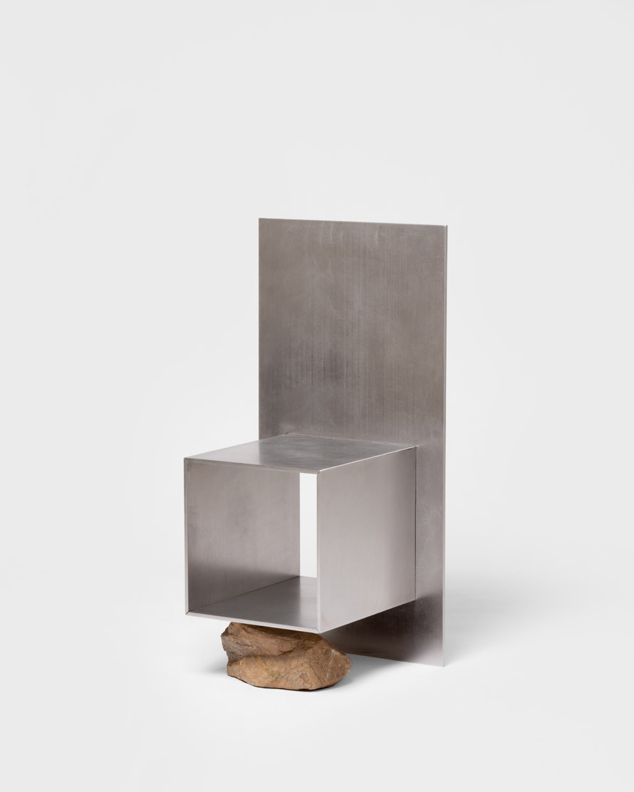
In picture no. 5 we see an experimental chair made of stainless steel and a stone by Korean designer/artist Lee Sisan from the series “Proportions of Stone”. This is a minimalist design experiment to build a bridge between nature and art. Lee founded his own design studio in 2018, where he explores the interactions between people, the natural environment and manufactured objects. Find out more about the series and Lee Sisan here.
