The internet is full of inspiration. Every day I discover beautiful designs and inspiring interiors – “The Edit” is home to a wide variety of projects, from architecture to photography to graphic design.
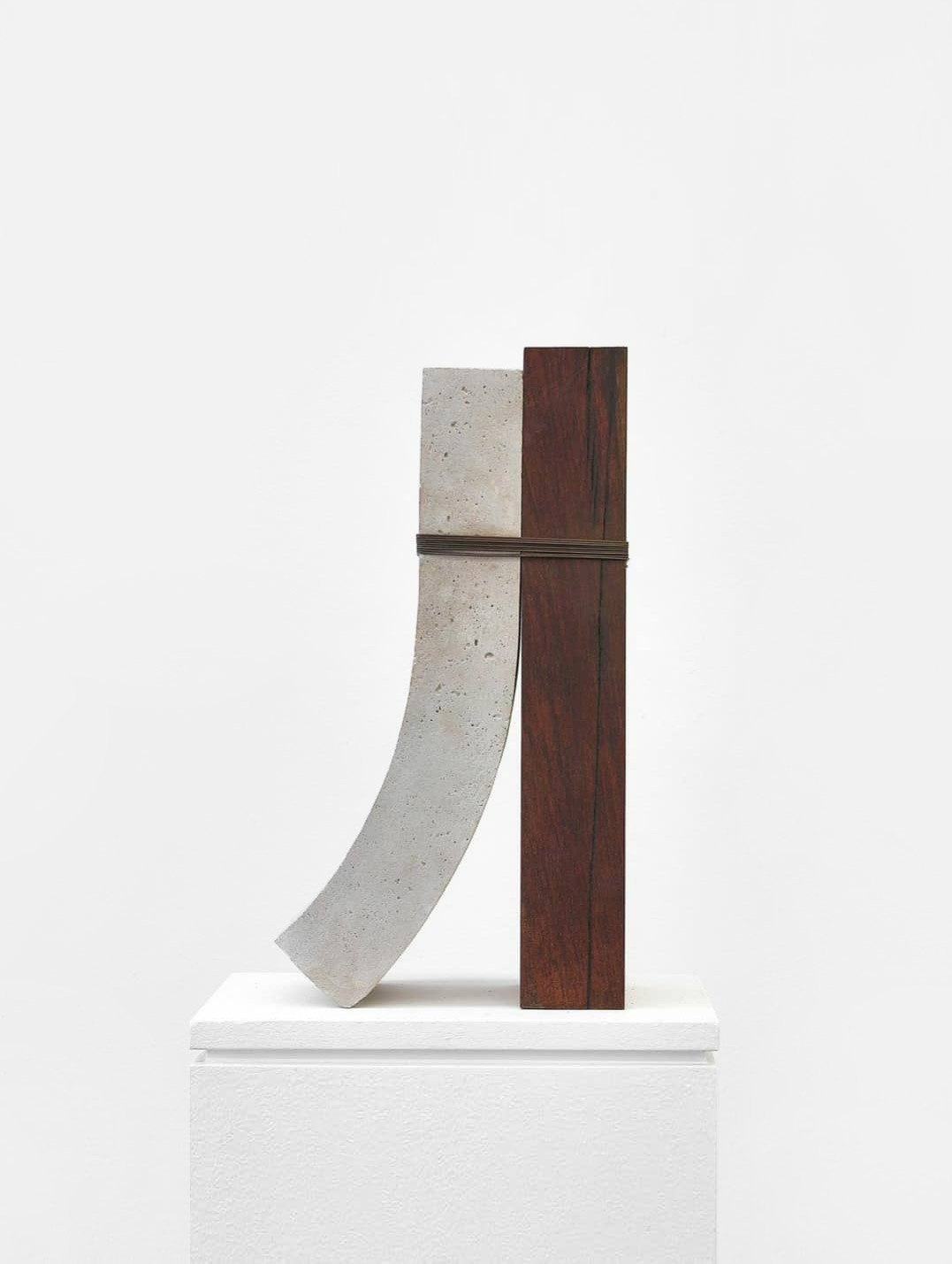
Let’s start with some random inspiration. The left image (no. 1) shows a very interesting and abstract sculpture by Bruno Cançado from 2020. Cançado’s work finds its inspiration in architecture and the multiple connections it creates between landscape, public space, and human habitation. His artworks are characterized by a particular physicality that highlights and reinterprets the memory and meanings inherent in the materials used.
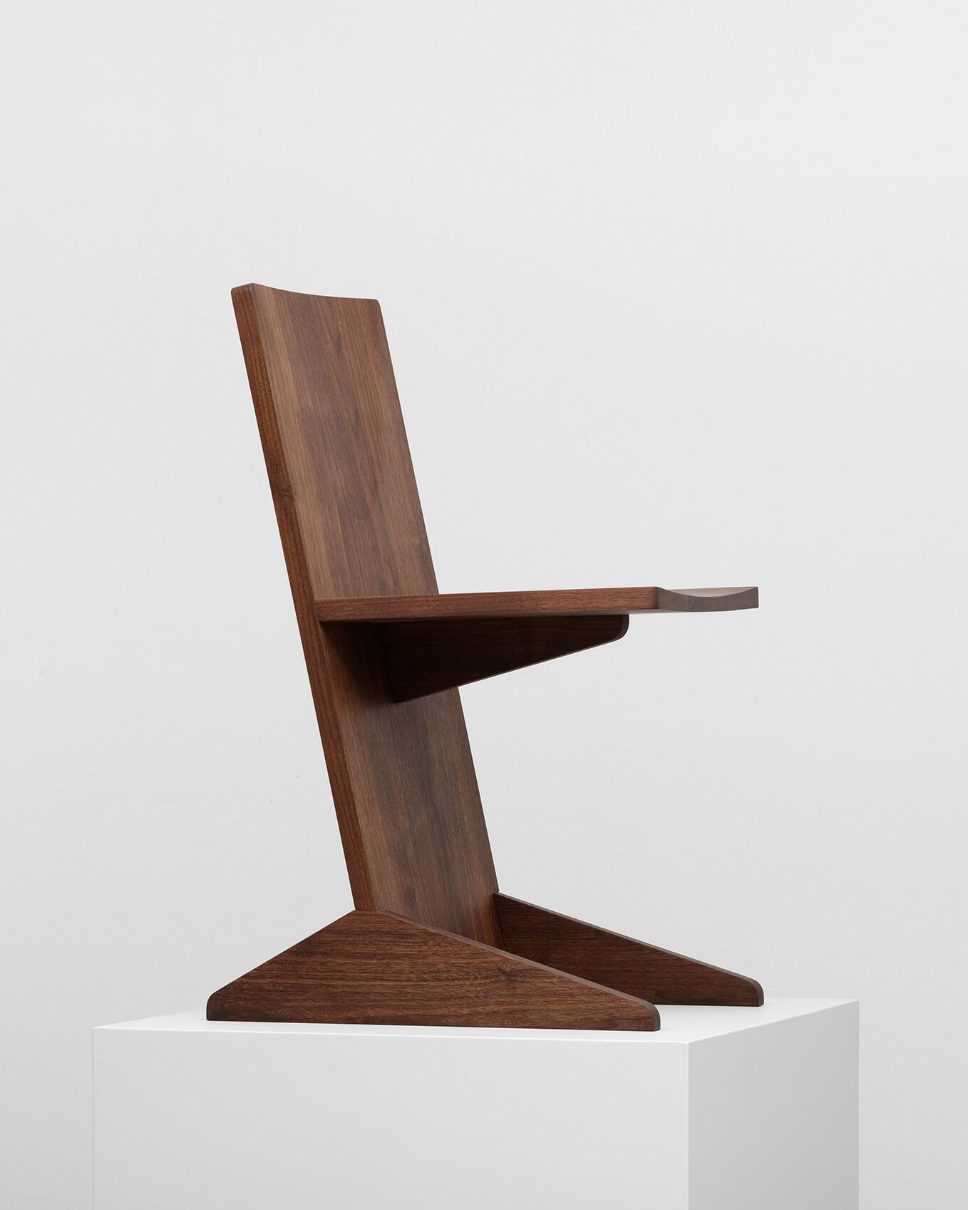
In the right picture (no. 2) you can see a minimalist chair created by the designers Mirko Ihrig and Casey Lewis from the design studio Lotto. The duo, working in Berlin and Milan, is known for its creative projects that combine industrial design, interior design, custom-made furniture, and experimental works. The Canti chair is built on an innovative concept that considers wood as an industrial material. The aim of the design is to create a chair made only of solid wood planks with a cantilevered structure. To add comfort to the minimalist structure, subtle curvatures were cut into the wooden planks.
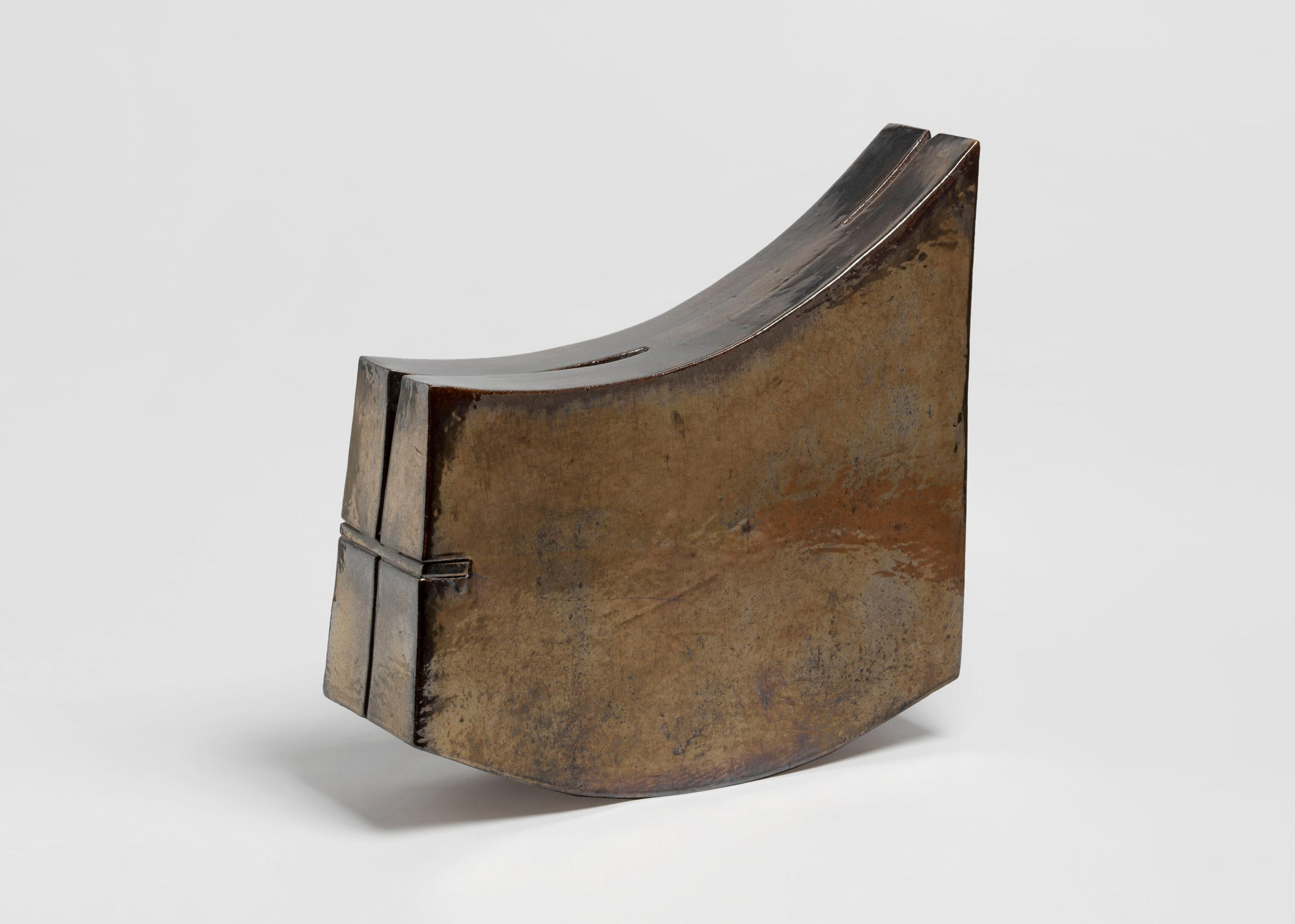
In image no. 3 we see a minimalist, abstract sculpture by Gordon Baldwin (born 1932). Originally, Baldwin focused on functional earthenware and tin-glazed stoneware vessels that he designed and assembled on the wheel. However, as his artistic vision matured, so did his approach to creating. Thus, he combined the free and unbridled creation of three-dimensional forms with the exploration of abstract painting and drawing techniques. Such is the case with the shown sculpture called “Rocking Piece” from 1971.
Timeless Minimalism – White Cave House by Takuro Yamamoto Architects
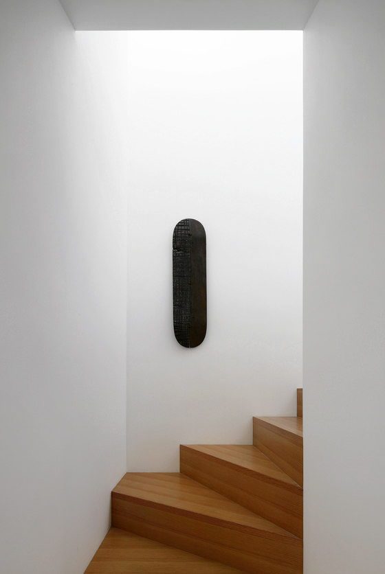
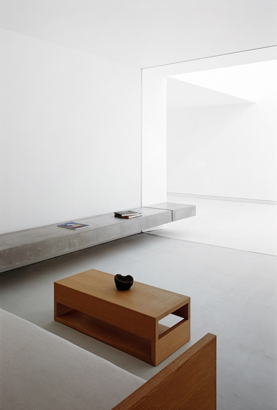
The fact that minimalist architecture is timeless is proven with this building by Takuro Yamamoto Architects from 2013. The house impresses with its clean lines, white exterior, and an ultra-minimalist central courtyard. The client wanted an all-white design with various outdoor spaces, including a covered entry porch, a two-car garage, and a courtyard.
To meet these requirements within budget while not neglecting the interior space for living, the architects suggested connecting and matching the outdoor areas. Thus, the idea of the “White Cave” was born, which would accommodate the light variations in the different spaces and provide a pleasant atmosphere. The photos of the building evoke timeless tranquility and invite you to relax in the courtyard. The warm colors of the wood of the furniture and stairs soften the design.
“Big Sky” by Johanna Grawunder
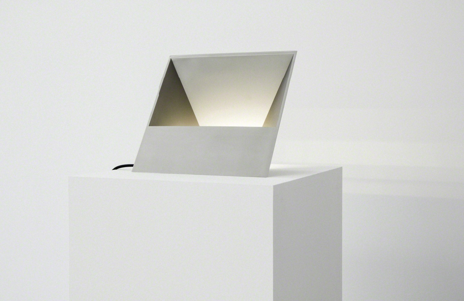
The following two lighting objects were created by designer, architect, and artist Johanna Grawunder. She designed them for the exhibition called “Big Sky” which she showed together with Carpenters Workshop Gallery in Paris. She cited American landscapes as the inspiration for her designs. They show, how Johanna Grawunder transforms her impressions of the vast Texas plains, rolling hills, and endless fields into minimalist and abstract works of art.
Random Inspiration – The many possibilities of the line
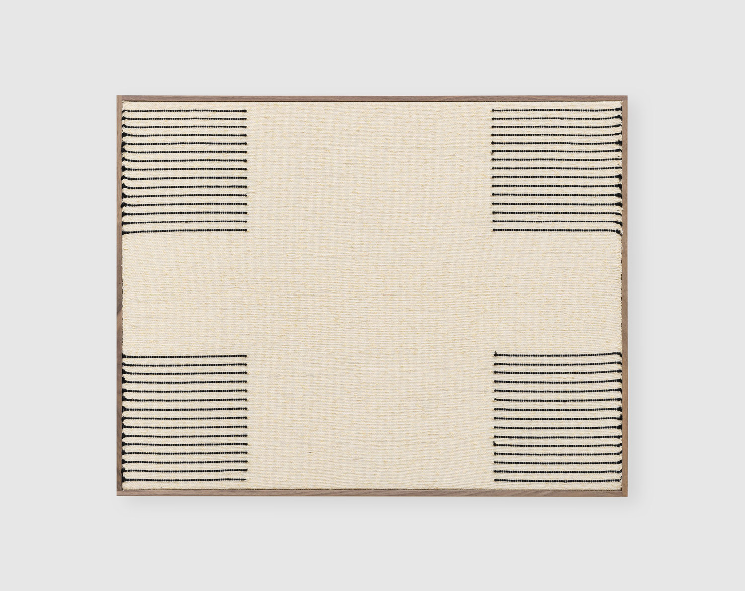
In the following images, the line plays a crucial role. Lines are a fundamental element in art. Lines can come in various shapes and thicknesses, from thin, delicate strokes to bold, expressive linework. They can be both straight and curved, and their arrangement can convey symmetry, dynamism, or tranquility.
In this work by Brent Wadden (Image 5), the line is also a central element. In his large-scale works, Wadden creates an impressive symbiosis of linear and abstract forms that serves as his leitmotif. In doing so, he employs a special technique: Wadden weaves the lines on looms, then stretches them on a raw canvas.
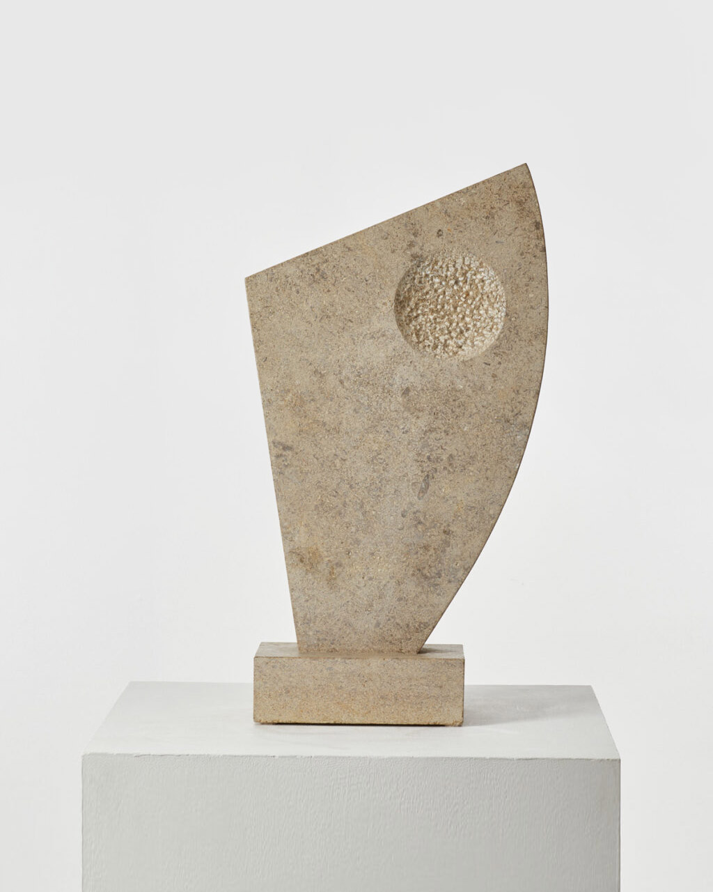
When a line closes, it forms a shape – as in this beautiful, abstract sculpture by an unknown Cambridge sculptor (Image 6) from 1980. The shape is reminiscent of the works of Barbara Hepworth. The image is from Beton Brut Gallery, whose curation I always admire.
And that’s it again for this issue. If you have found something interesting, beautiful, or fascinating that you would like to share with us, please send an email to [email protected].
