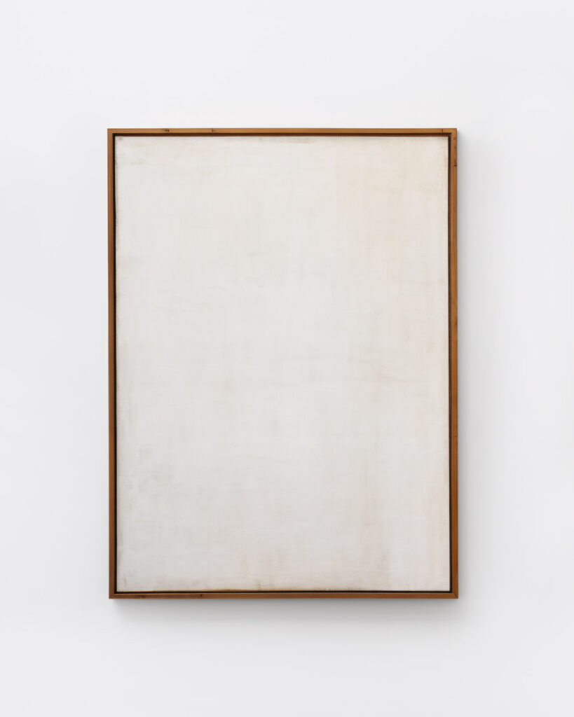
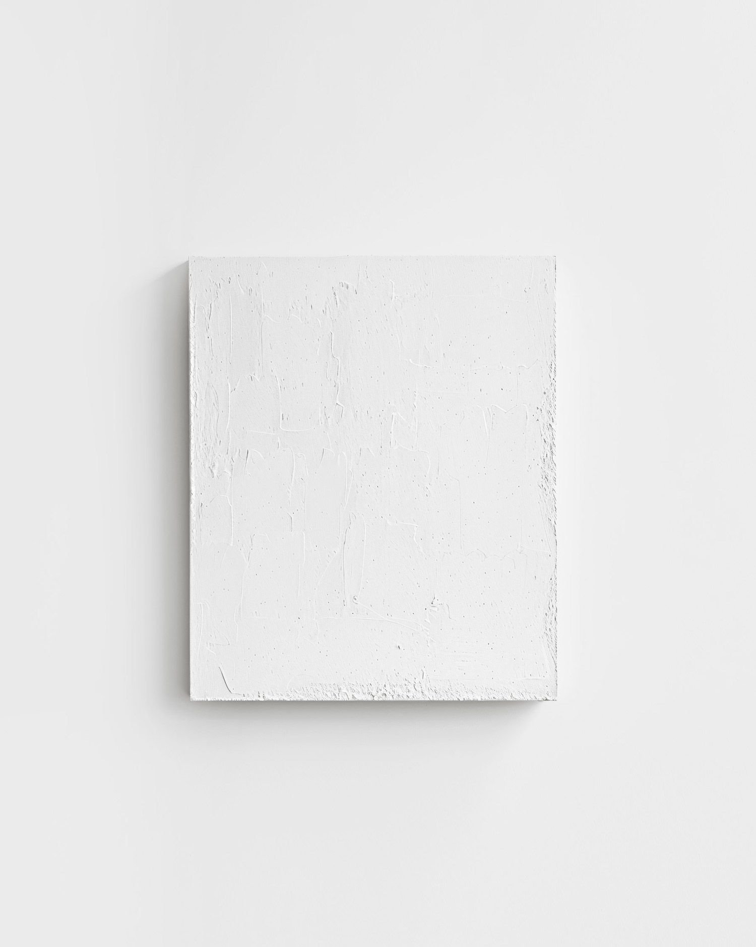
Minimalist art has its critics and admirers – but what is it about this type of art that makes it so controversial? While some appreciate the calm colors, clean lines, and shapes of these works, others find them too emotionless and boring. Many consider minimalist art worthless because it doesn’t seem to have any deeper meaning. But is this really the case? Can minimalism in art be too minimalist?
Kazimir Malevich was one of the first to cause confusion in the art world in 1915 with simply a black square on a white background. Many art lovers and even critics wondered what he wanted to say with it. People were used to seeing signs, symbols, and figures in paintings – but here this was not the case. People stared at the painting, trying to recognize something. But the only thing they saw was black paint on a white canvas. As Tate so beautifully put it, “it was the first time anyone had created a painting that wasn’t of something.”1 For Malevich, however, this painting was so much more – it was a sign that art should find its meaning in itself.
In the 1950s and 1960, other artists who played with such reduced works followed: Robert Ryman, Donald Judd, Agnes Martin, Tony Smith, and many others. They wanted to distance themselves from the emotional and dramatic art movement of Abstract Expressionism. It should not be about them and their feelings, but only about the work. It should be about the viewer and how he or she deals with it, when one looks at it in different light moods, and how it can change the perception of the room.

Many artists brought tremendous depth to their works – it is not simply a black canvas, for example, the paintings absorb the light of the environment and thus change their color nuances. Brushstrokes become visible. Dabs, strokes, lines, patterns, or smooth areas of color. And now it is no longer simply a painted canvas (MoMa has published an interesting video about one of Ad Reinhardt‘s works, describing exactly this level of detail, watch it here).
And so the viewer defines the work, not the artist. The viewer defines what he or she sees, feels, and interprets. This makes minimalist art universal. No matter who looks at it, they will see something different in it than you do. And that makes it so special. For this reason, minimalism in art can never be too minimalist. How can something be too minimalist when it triggers so much in the viewer, both positively or negatively?
Controversial art = good art?
So why do some people reject minimalist art so vehemently? Well, I’ll try my hand at an explanation: people like to be led. And they like things that are easy to consume. So it is in art, too. Is it perhaps just that, then? That they need to guide themselves when they look at minimalist art? That nothing about it is so obvious that they can relate to their own experiences, values, and emotions? That they are not simply presented with what they are meant to see? (In the following article, I have focused in particular on these emotional and controversial reactions. Read it here)
I don’t know. But through their controversial opinions and views, minimalist art gets the attention it deserves. What polarizes has meaning. It would be a shame if the outstanding works of minimalist artists ended up in insignificance.
How do you see it? When is minimalism in art too minimalist for you? And what reaction does it evoke in you? I look forward to your comments!
Further Reading
1 https://www.tate.org.uk/art/artists/kazimir-malevich-1561/five-ways-look-malevichs-black-square
https://www.theguardian.com/education/2001/dec/01/arts.highereducation2
About Exploring Aesthetics:
Sarah loves asking questions and exploring the things she engages with on a daily basis. Exploring aesthetics is her column which discusses art, design, and aesthetics to explore, inspire, and question the status quo.


